adidas Runtastic
PRODUCT
Branding / Visual Identity / UI-Design / Content
The transformation of an established brand throughout the past three years.
Rebranding #1
In the few years I worked at Runtastic, the company was just acquired by Adidas. Although the brand was moving forward, we in the Design Team felt that the visual identity had been left behind. Therefore, we pushed for an overhaul.
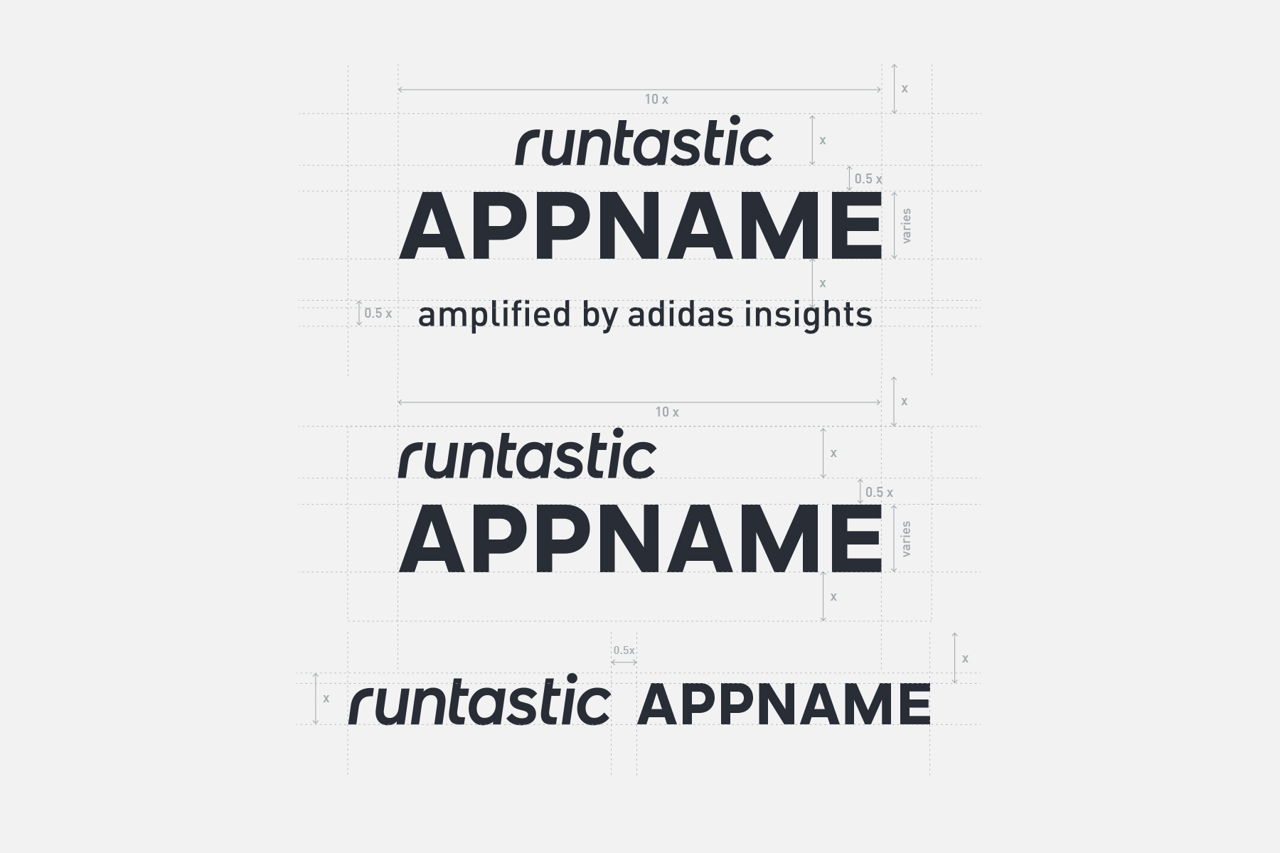
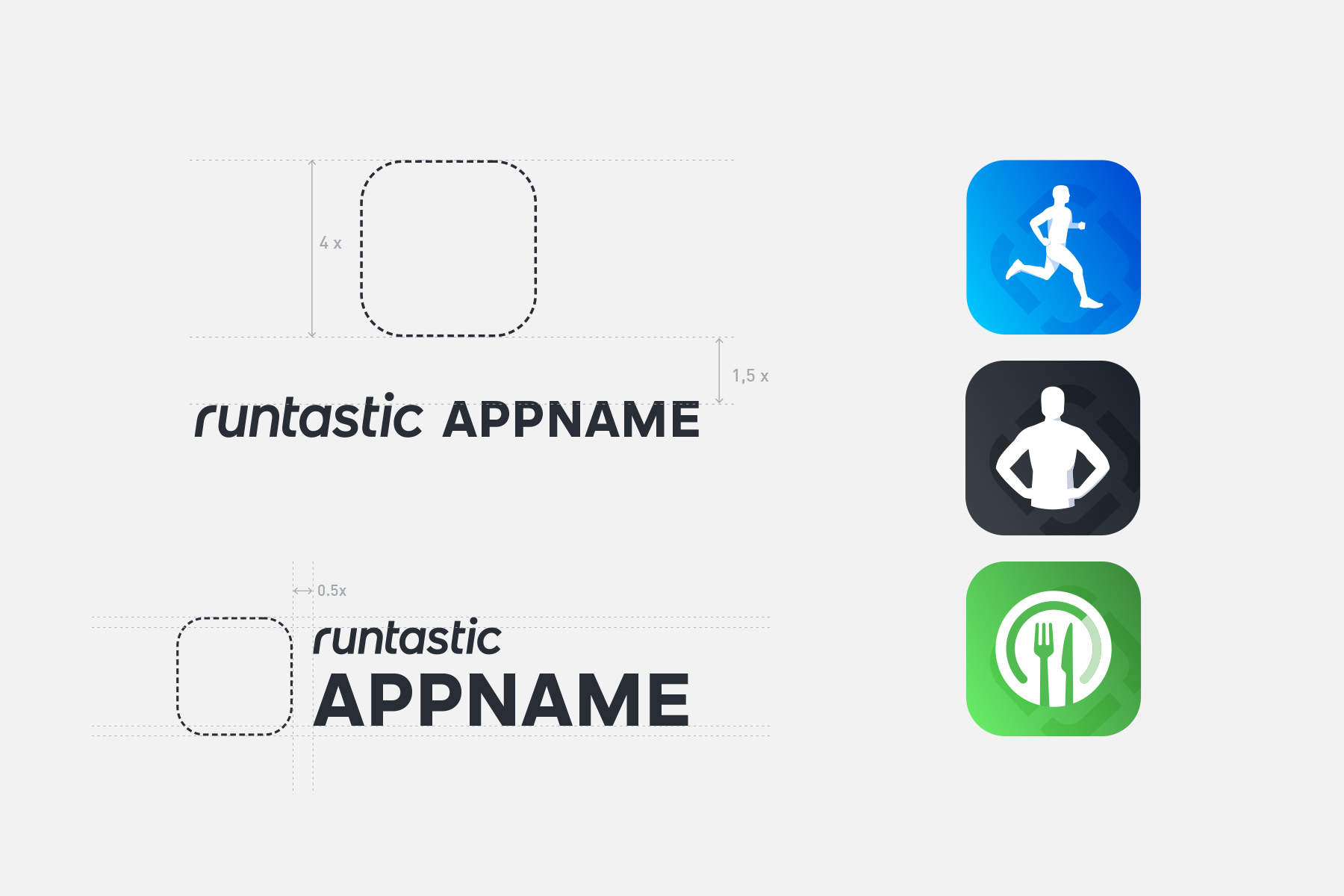
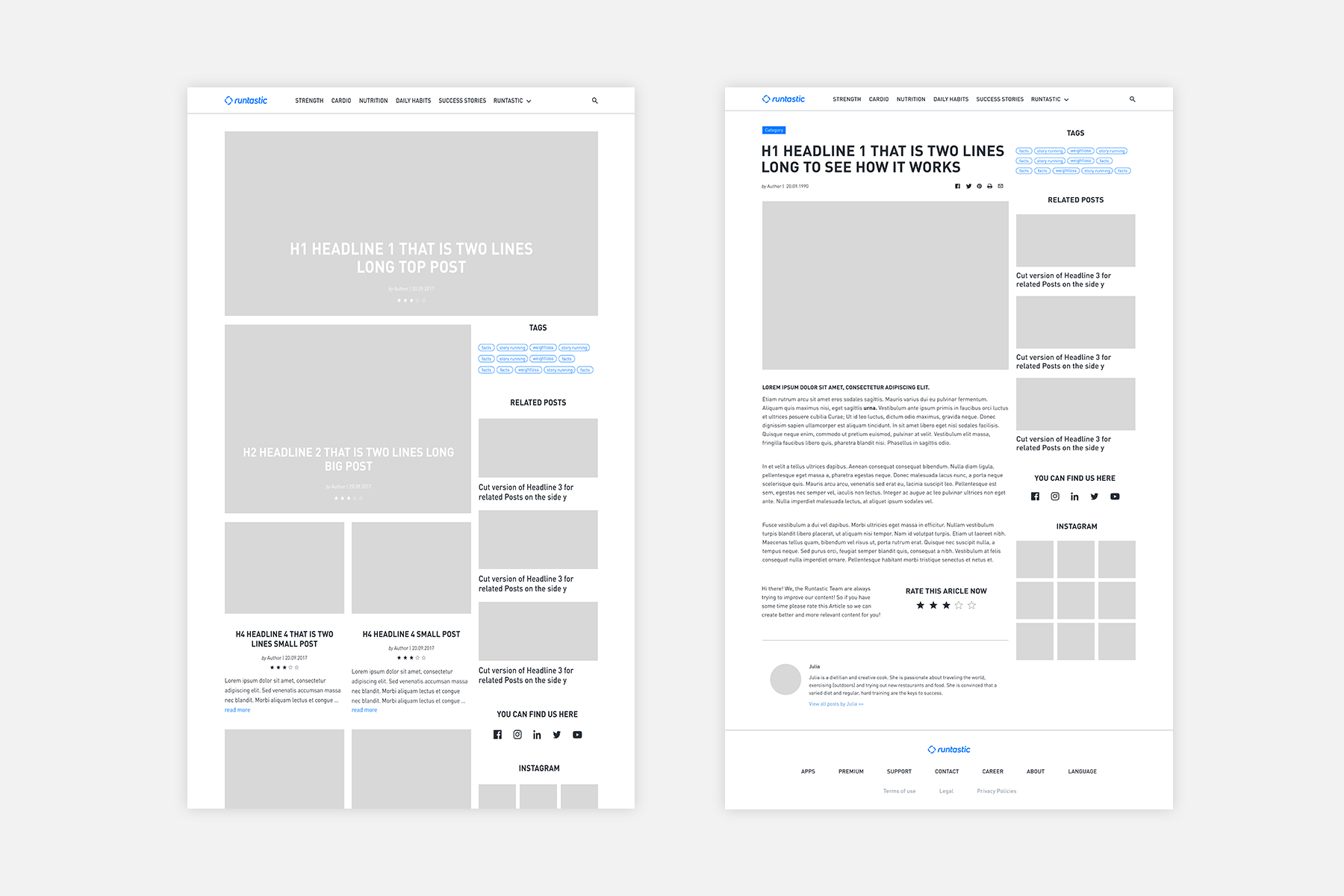
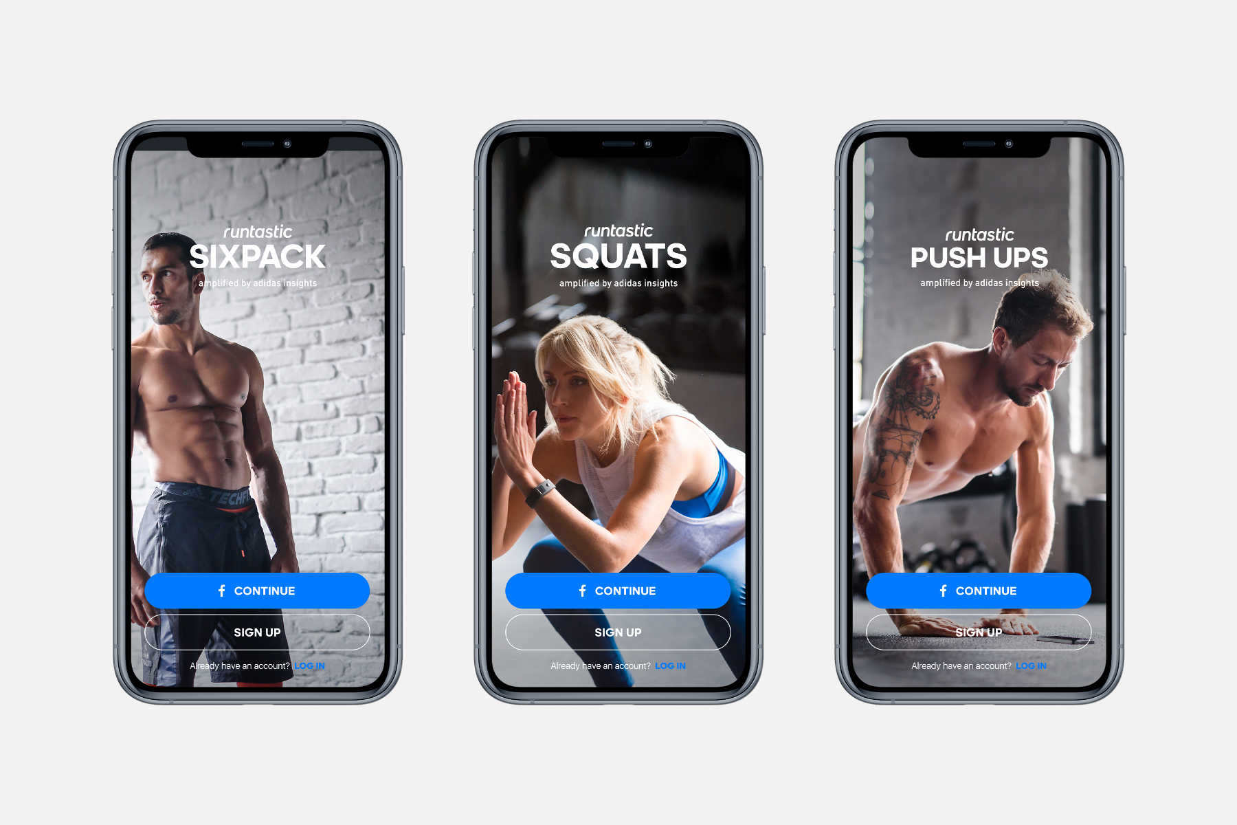
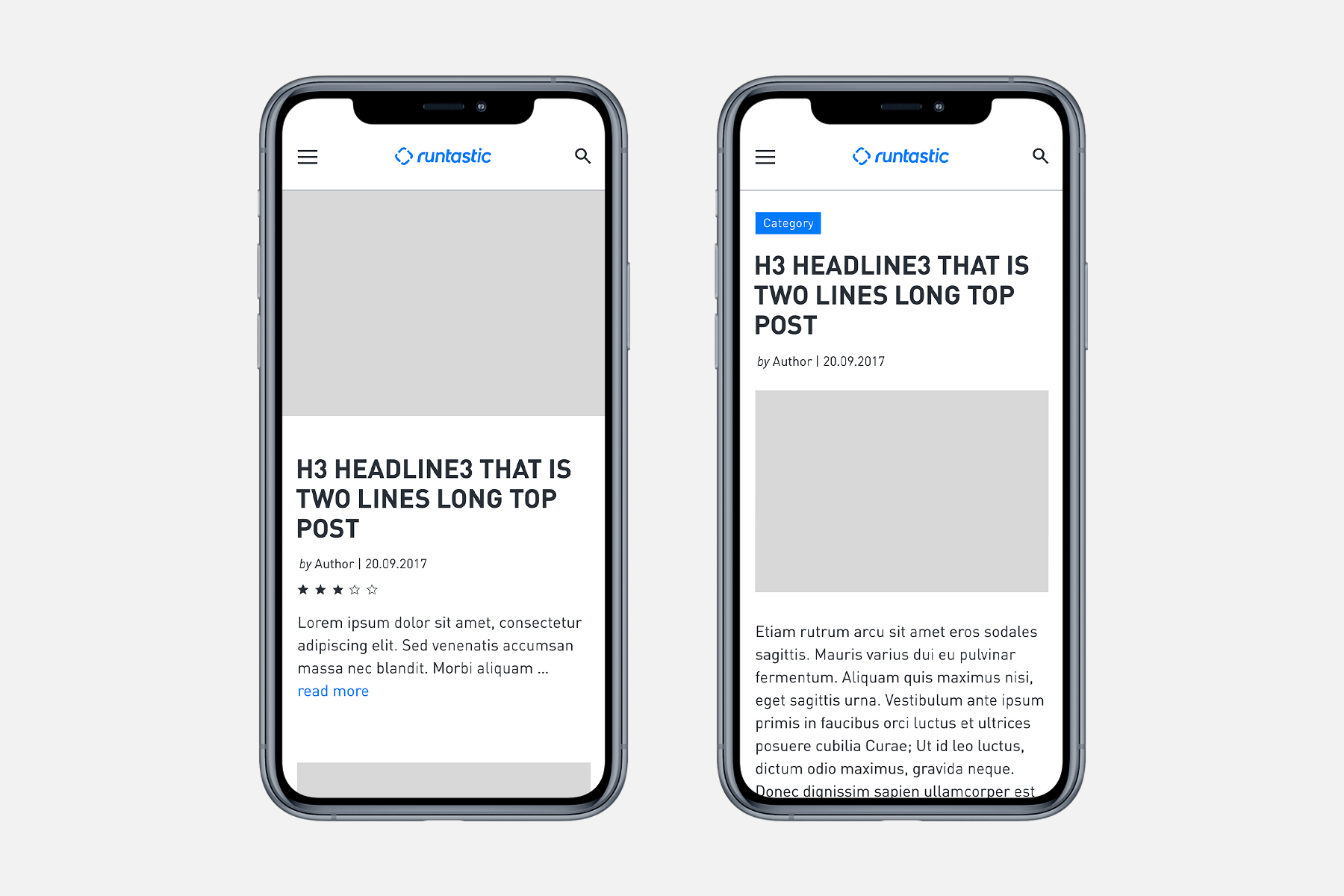
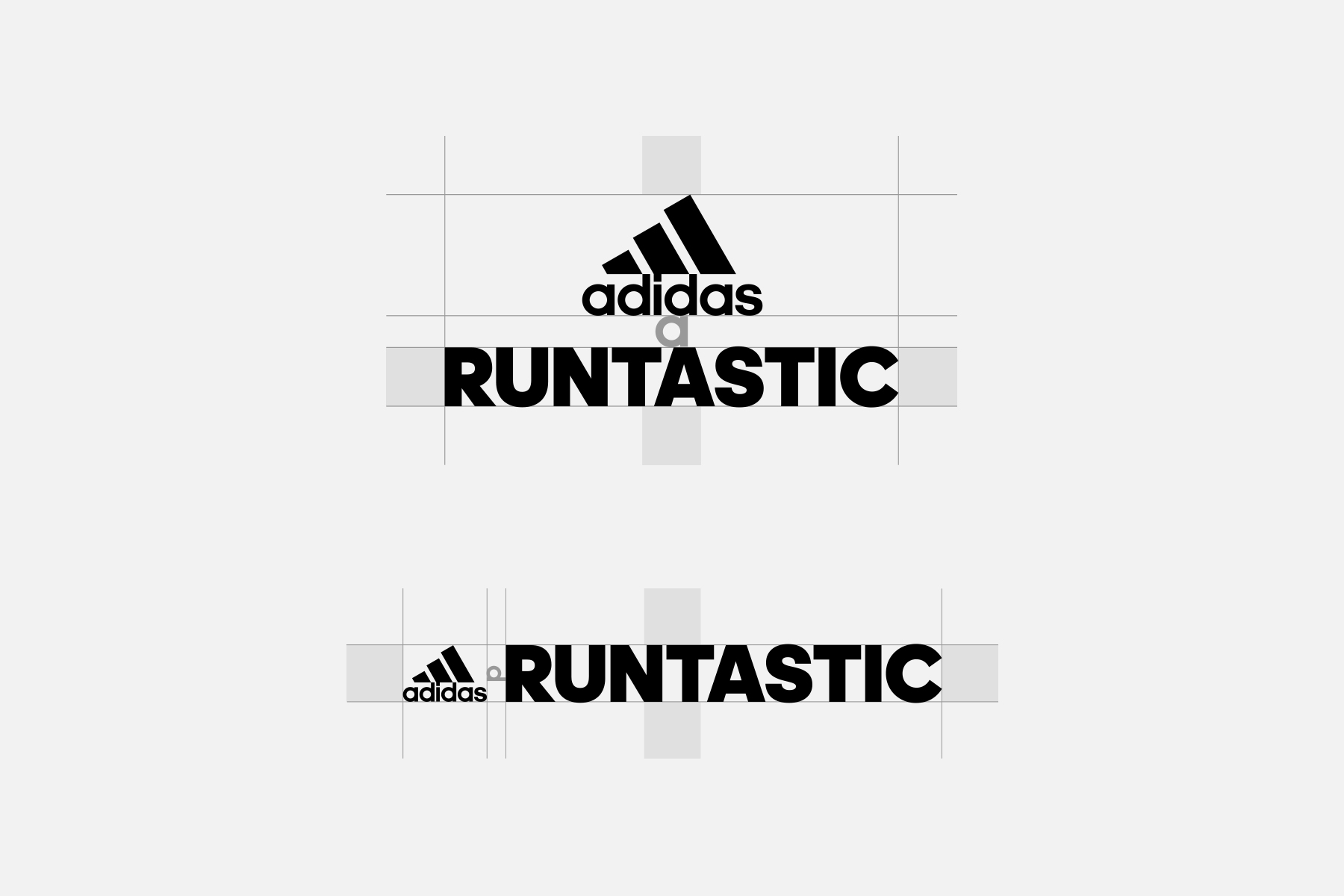
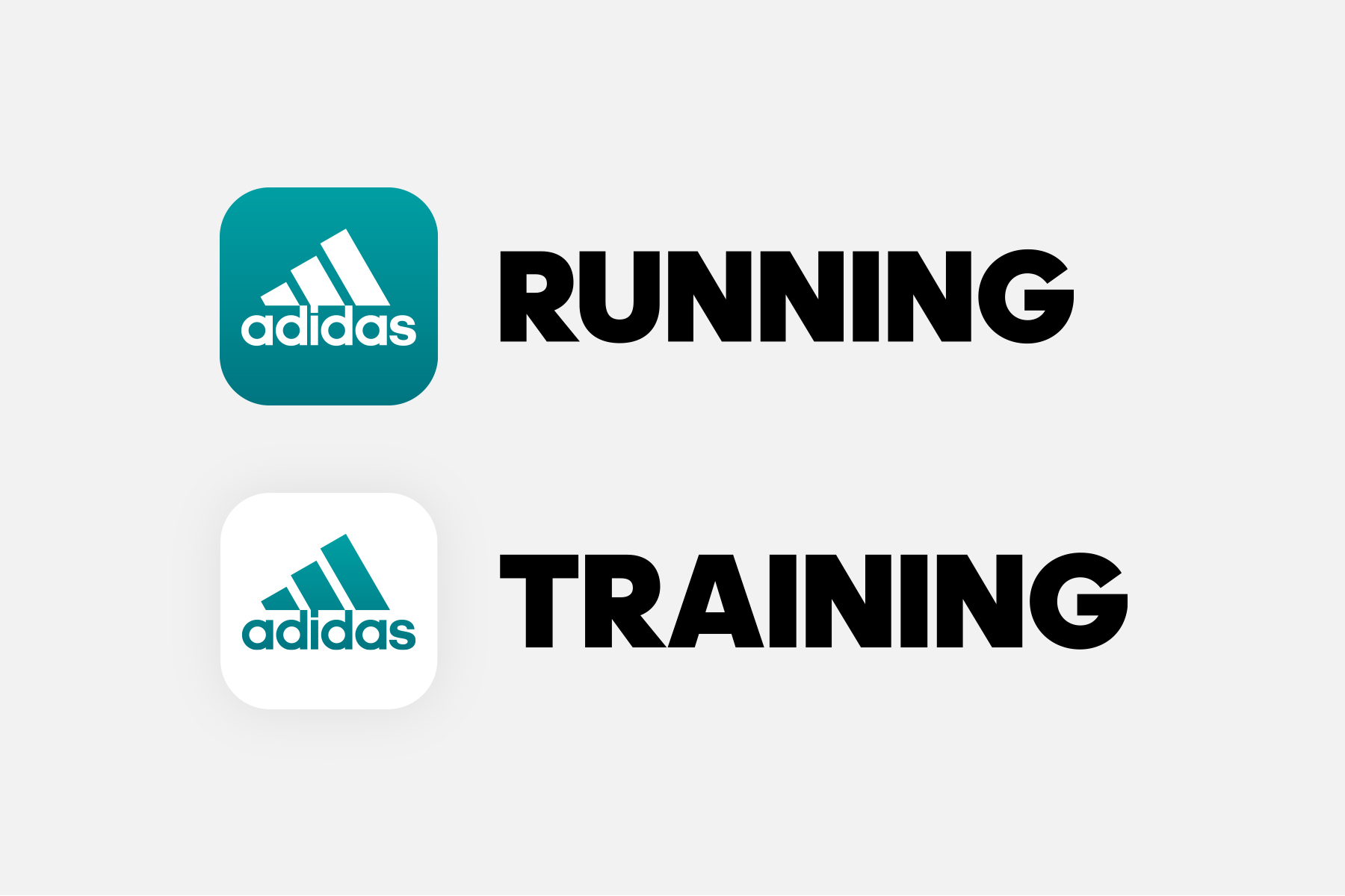
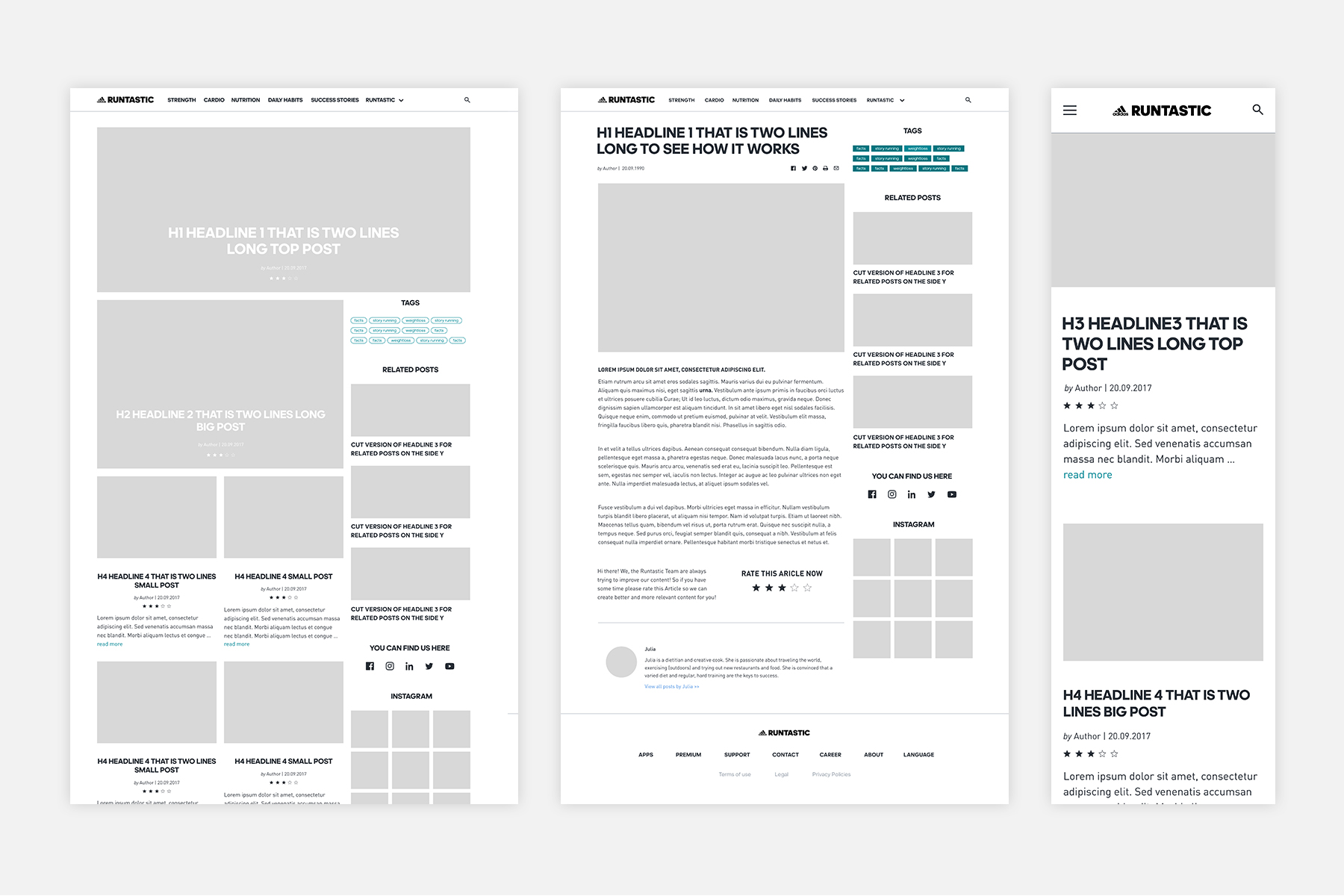
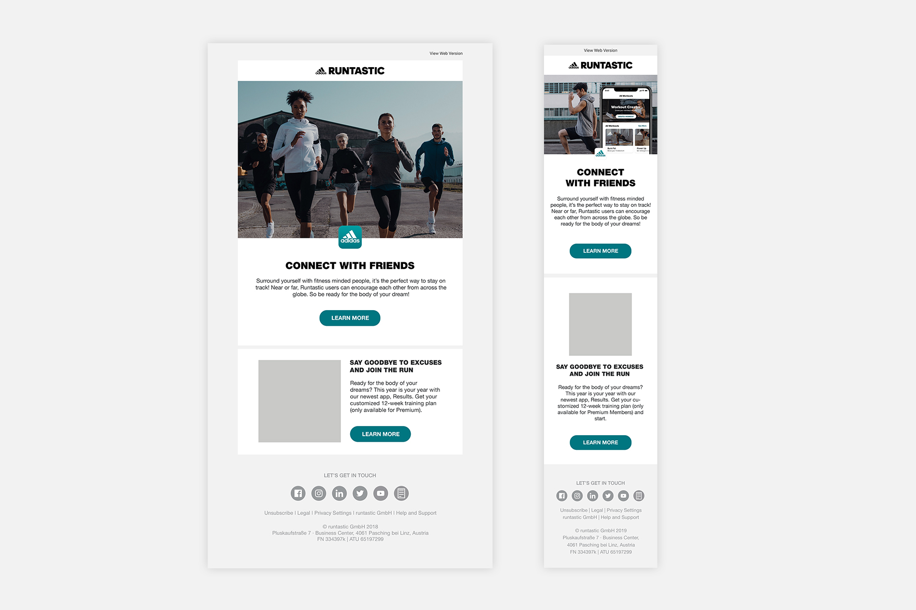
To modernise the logo, I modified the font Maax and implemented some of the old logo characteristics like the characteristic curve of the “r”, which was later also utilised as a brandmark. Following this initial change, we went on to improve the app icons and developed a consistent design for the different apps. After that, we continued by improving the Runtastic Blog, one of the core touchpoints we had with our users, to match our newly developed visual style. The primary focus here was on improving usability.
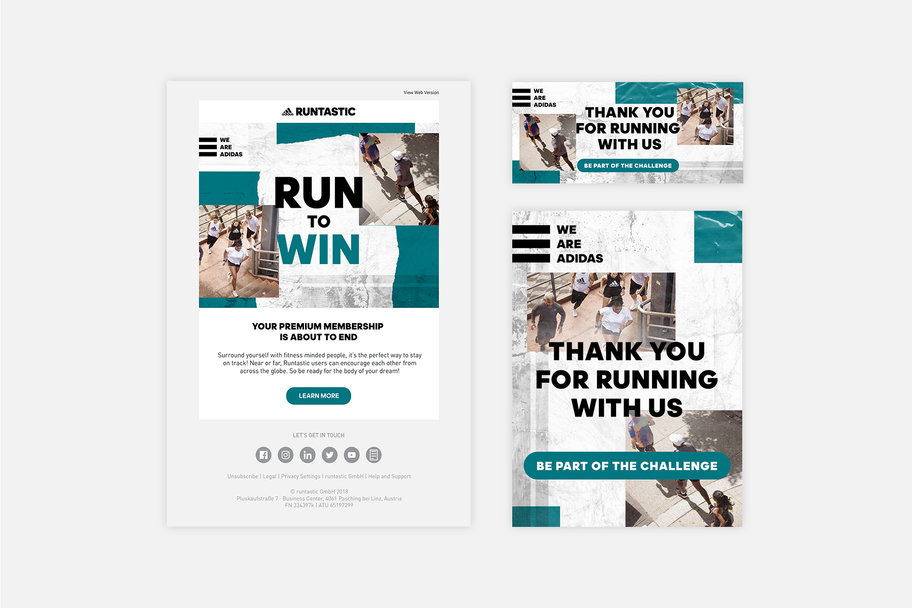
REBRANDING #2
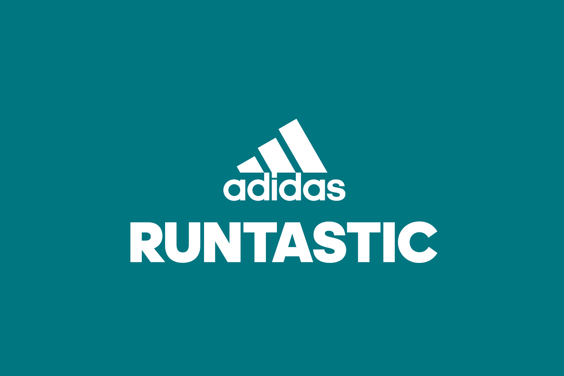
A few years after the first rebranding, the partnership between Adidas and Runtastic grew closer and it was decided that the designs of the two brands should align more. The goal was to make it obvious at first glance that Runtastic is now part of the Adidas family. We took initiative and presented ways to bring our brands closer together without overlapping with some of the existing Adidas sub-brands. Changes were made to the name, logo, colours, and typography throughout all our channels to merge the two brand designs together and create a more consistent brand experience.
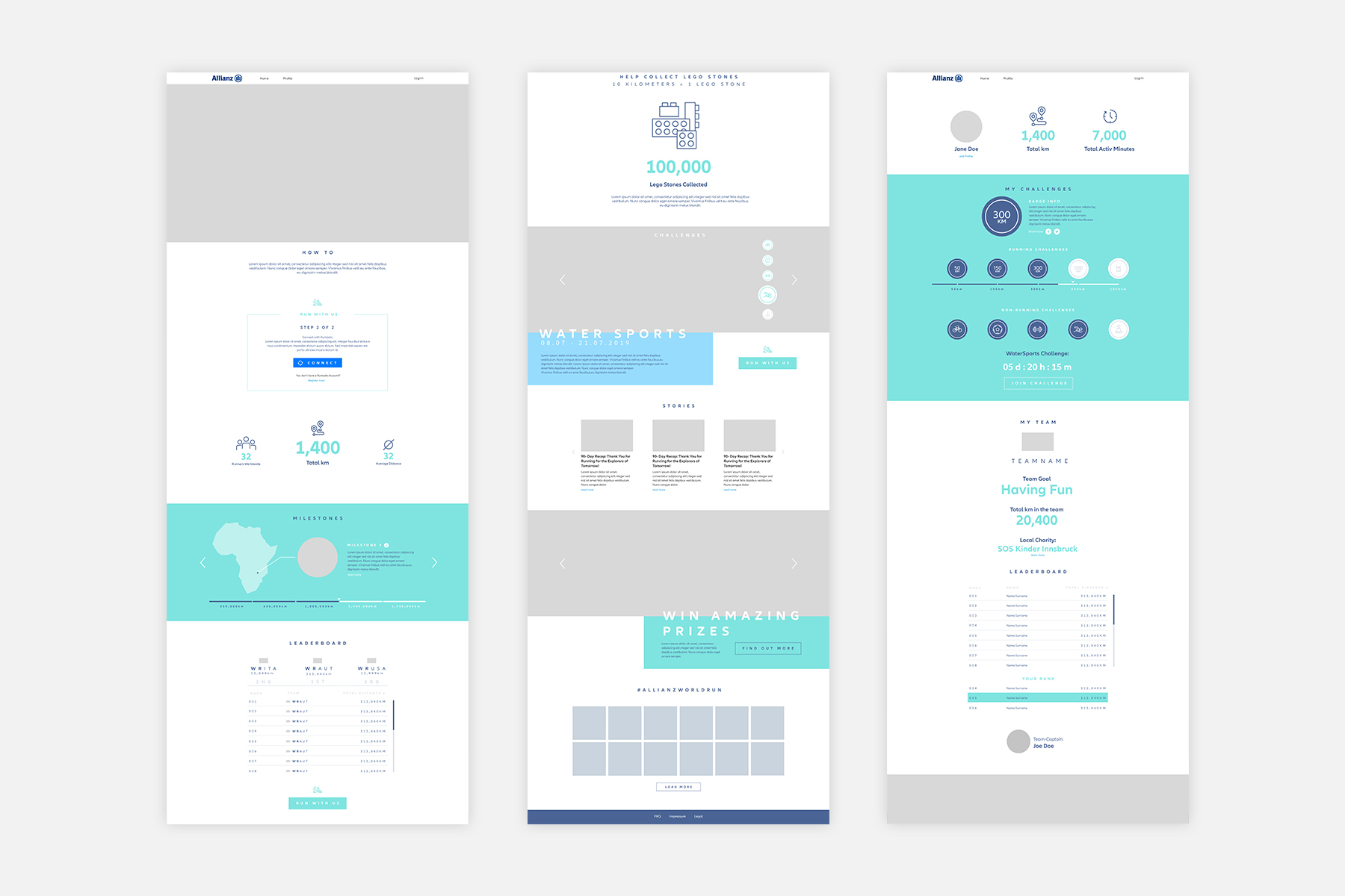
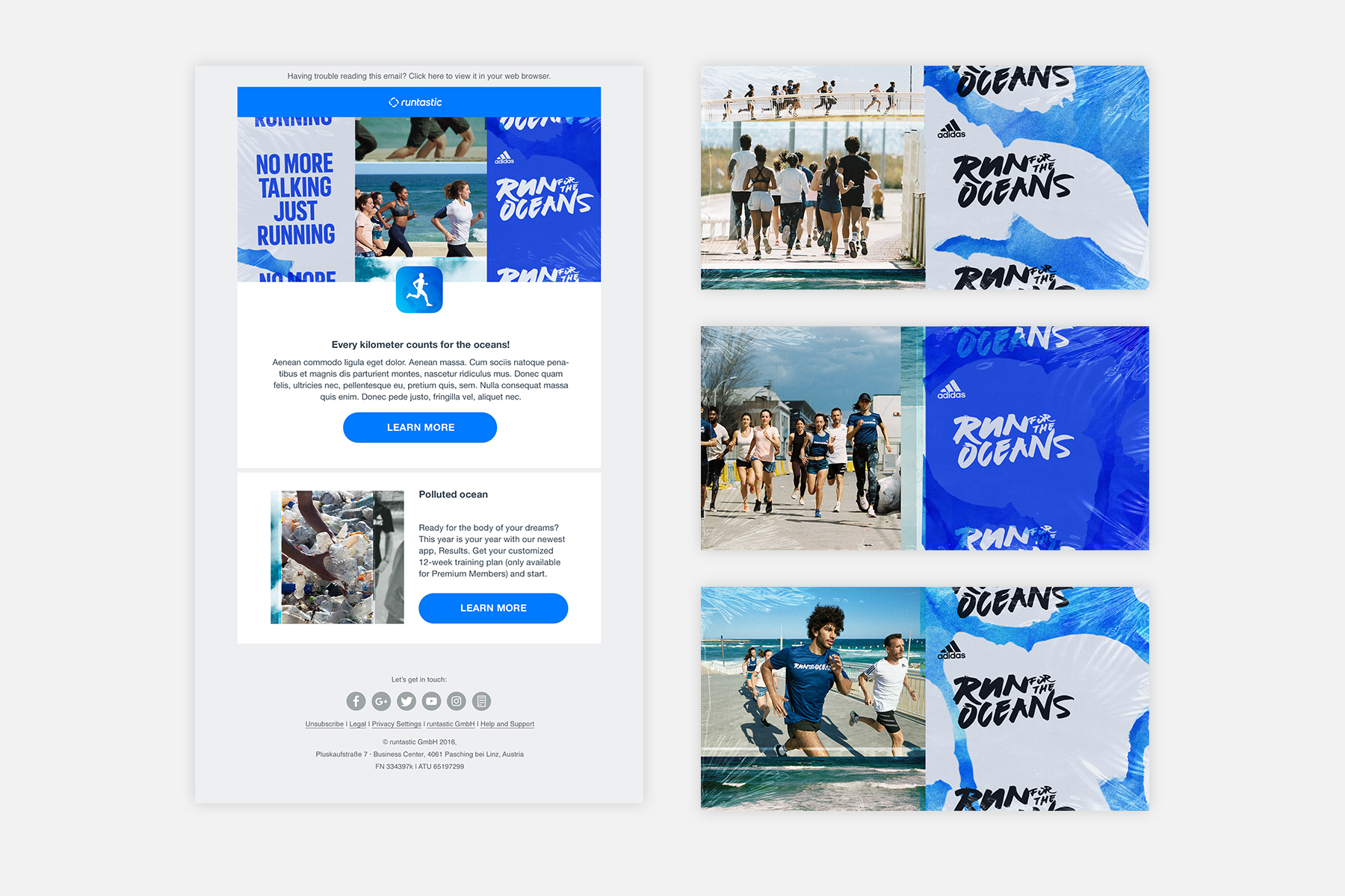
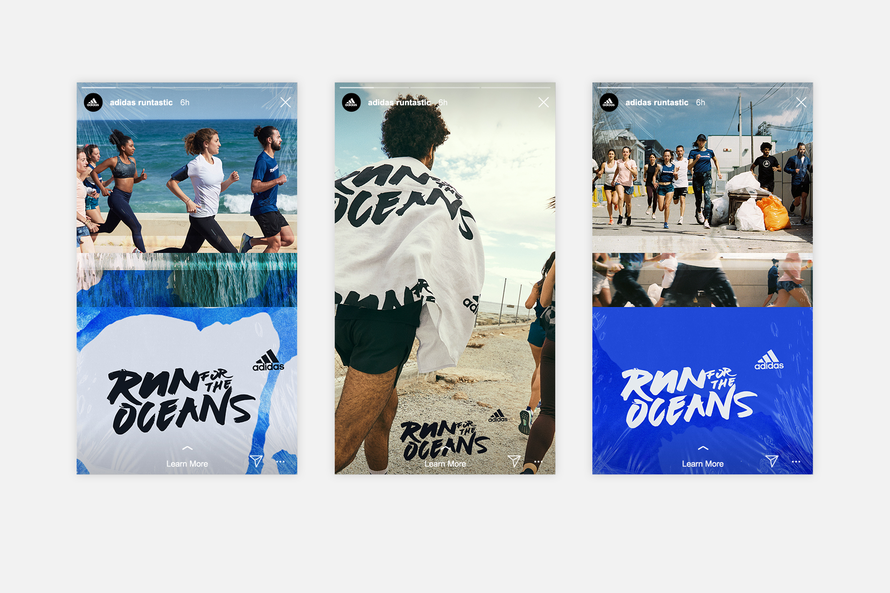
Cooperation, Community and Cause were increasingly the focus of the Runtastic Campaigns in addition to the general goal of increasing revenue and user base. The most interesting campaign in my opinion was the “Run for the Oceans” campaign in cooperation with Adidas. This project was developed to increase awareness of marine pollution and raise money to fight this problem.
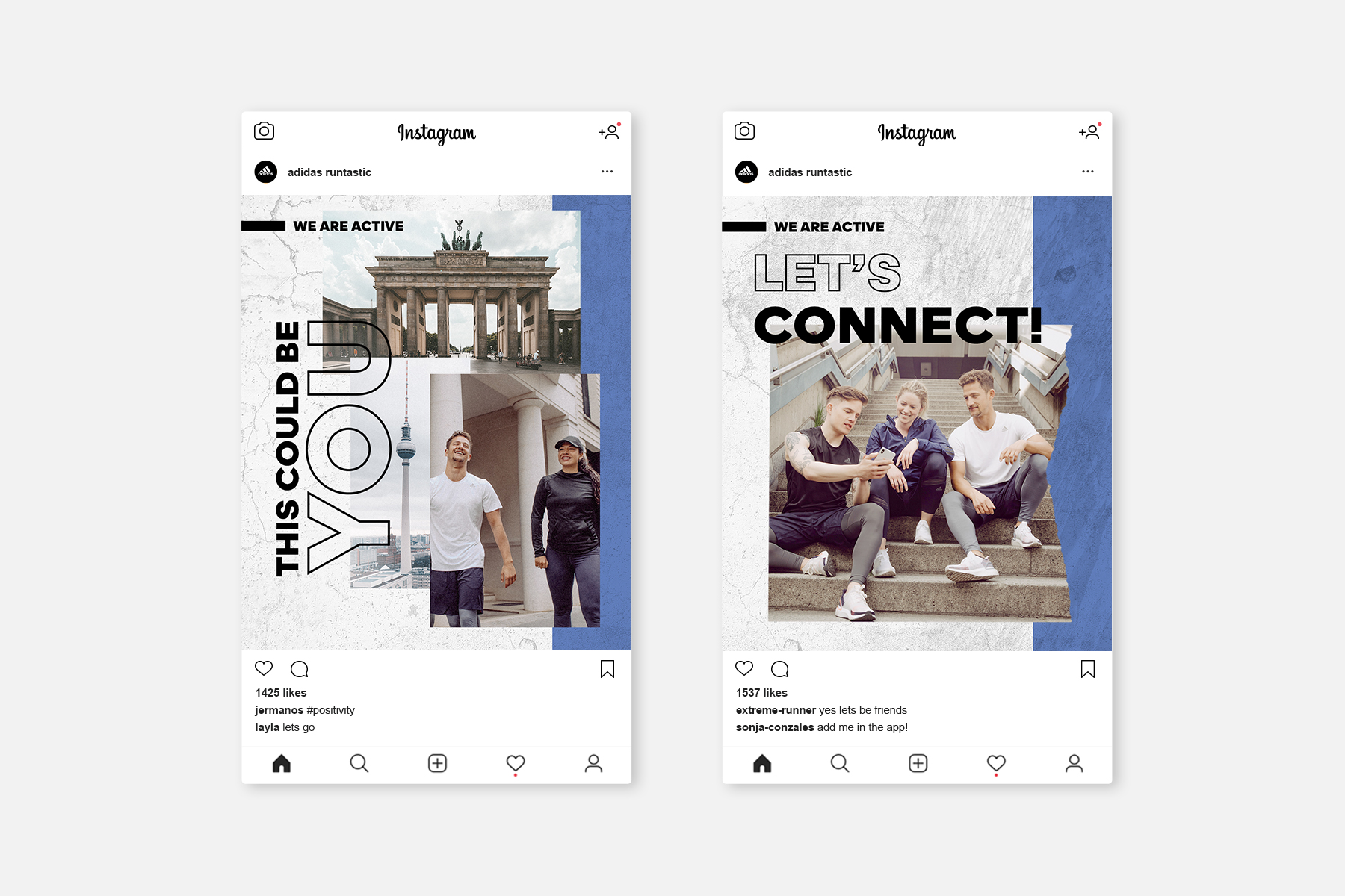
Another exciting campaign was the brand alignment campaign in which we had to inform and introduce our existing user base to the big changes to come.
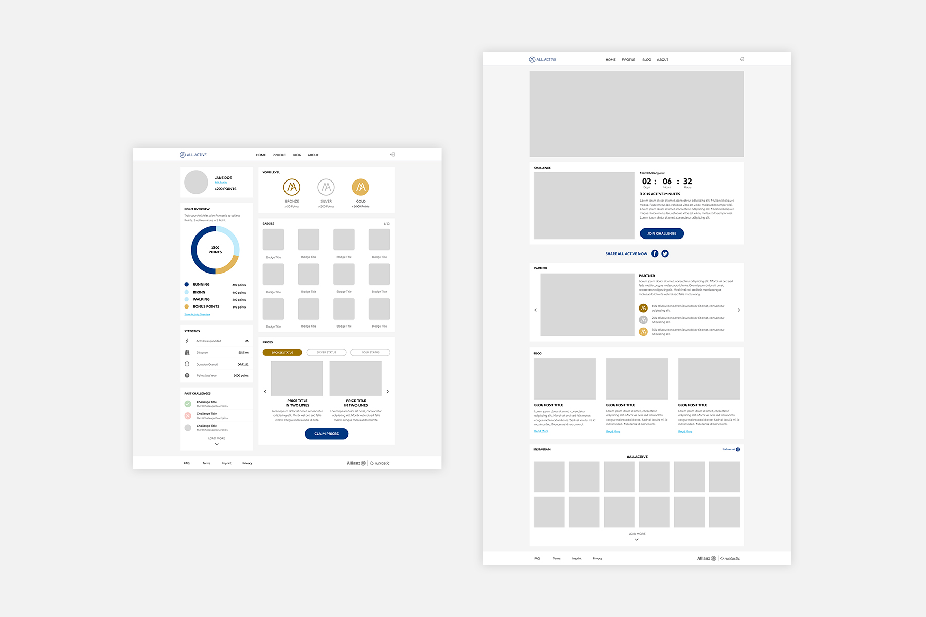
B2B
For some time, B2B was also a focus of Runtastic. Here, my job was to design customised platforms for our partners to promote a healthier lifestyle for their employees or customers.