Glazed & Confused
PRODUCT
Branding / Visual Identity
Creating the brand identity for Glazed & Confused, my idea of a donut shop focusing on hand-made sweets and goods.
CONCEPT
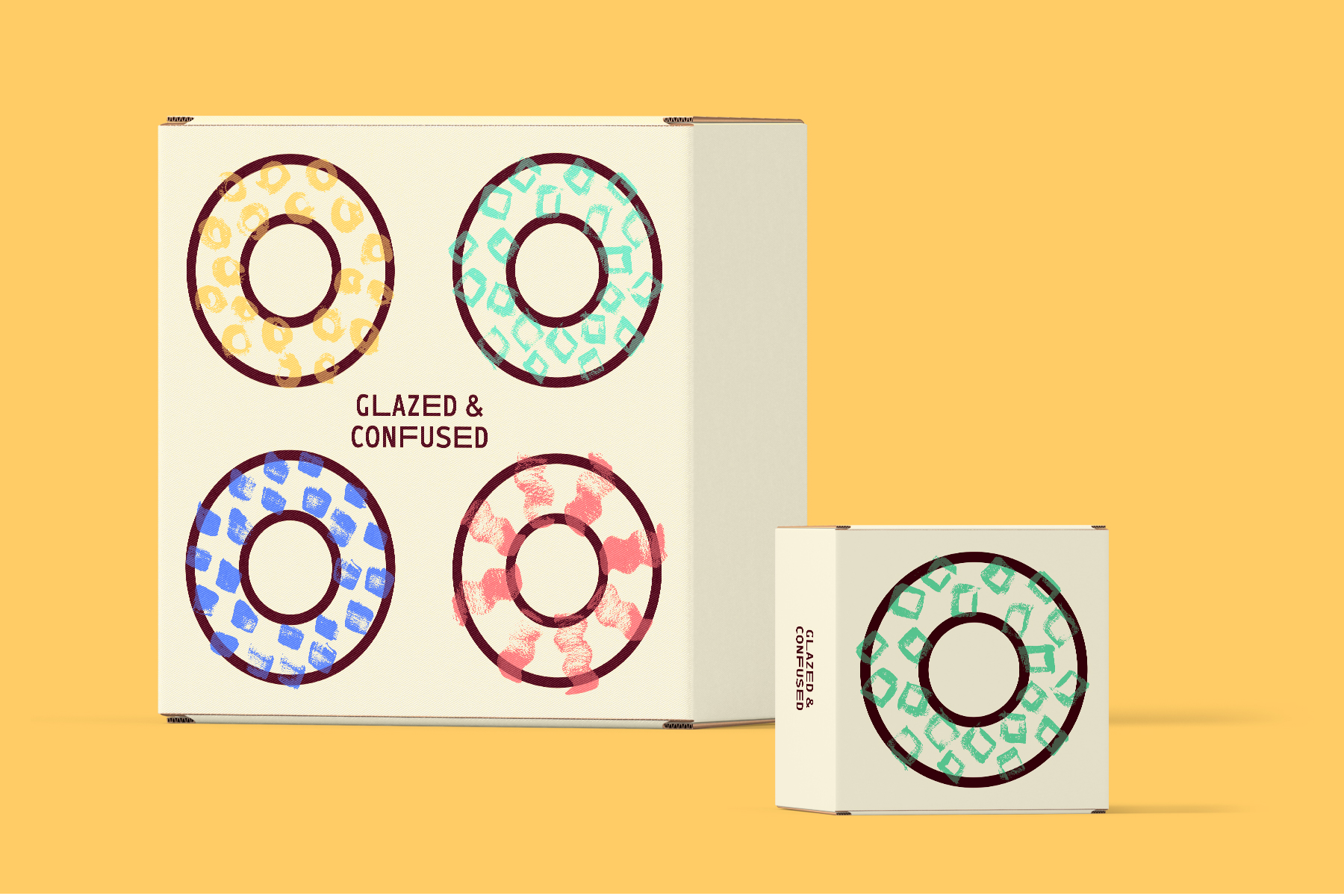
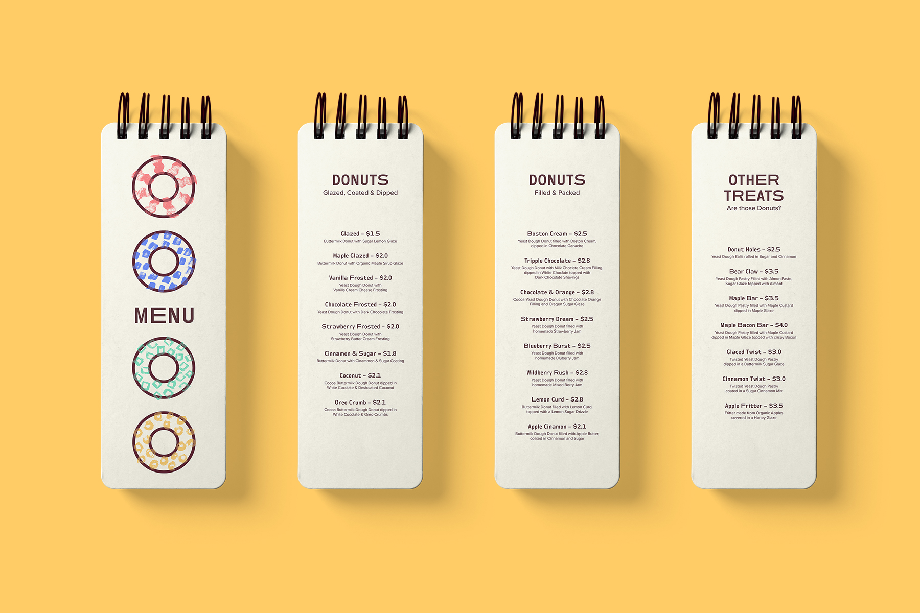
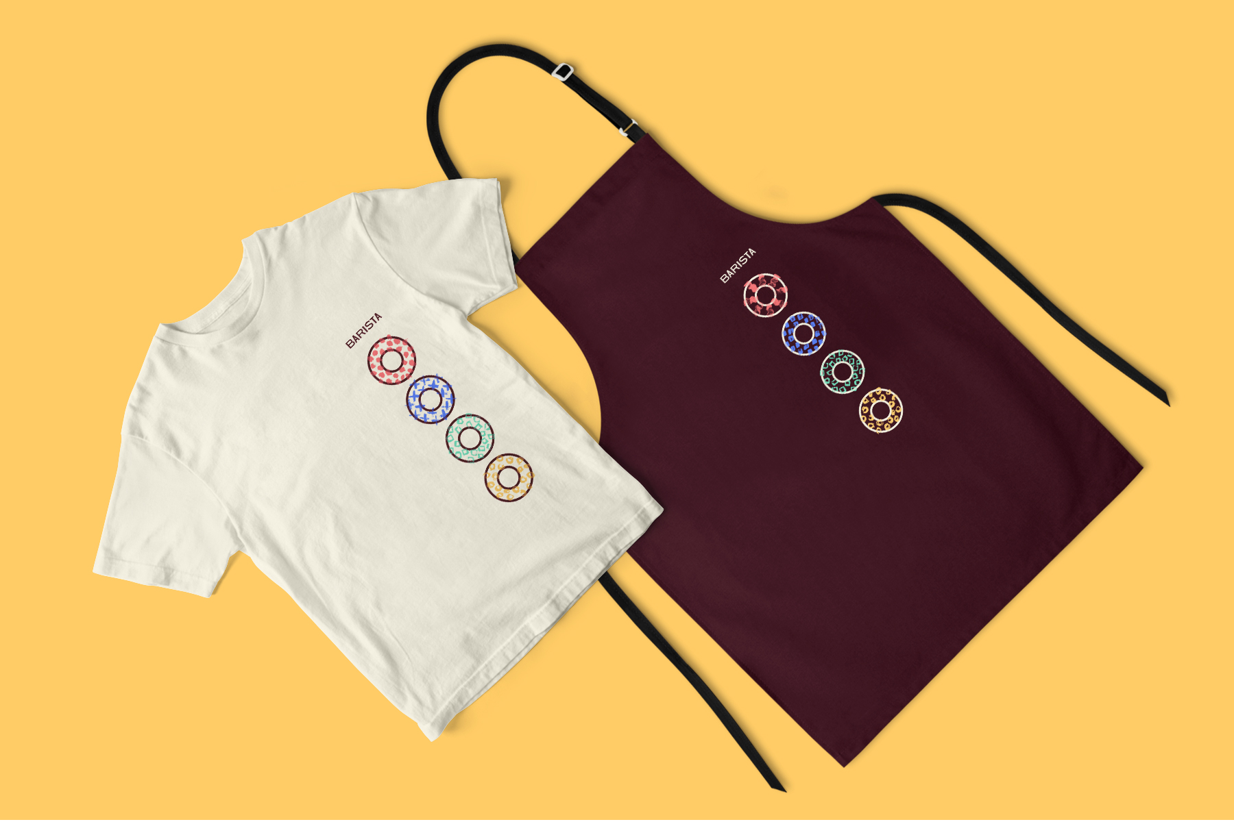
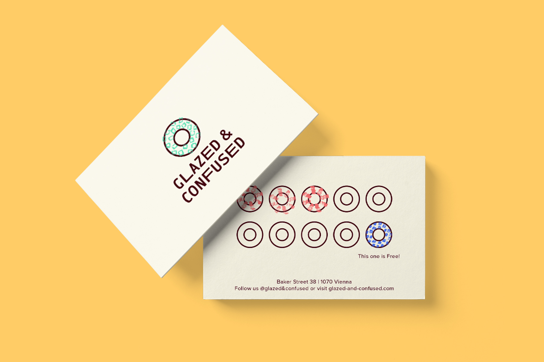
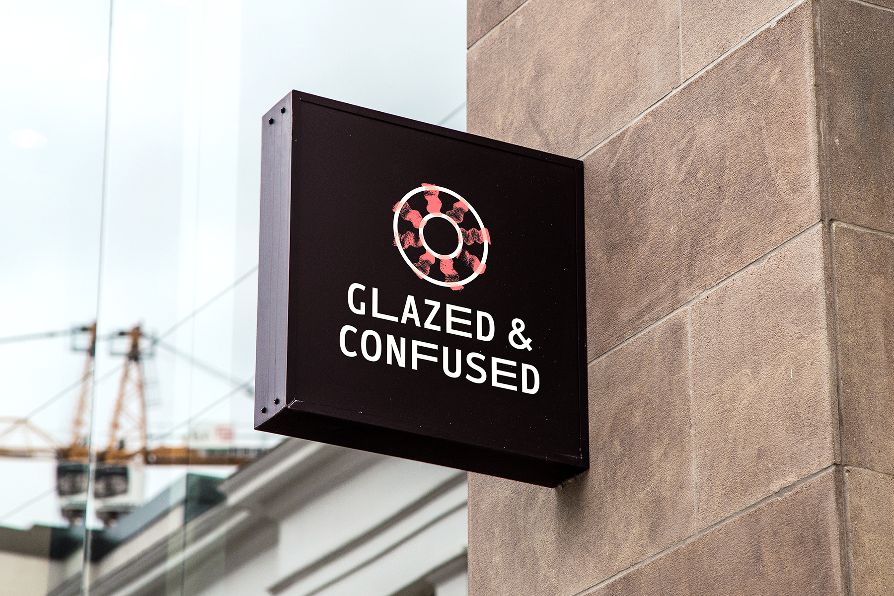
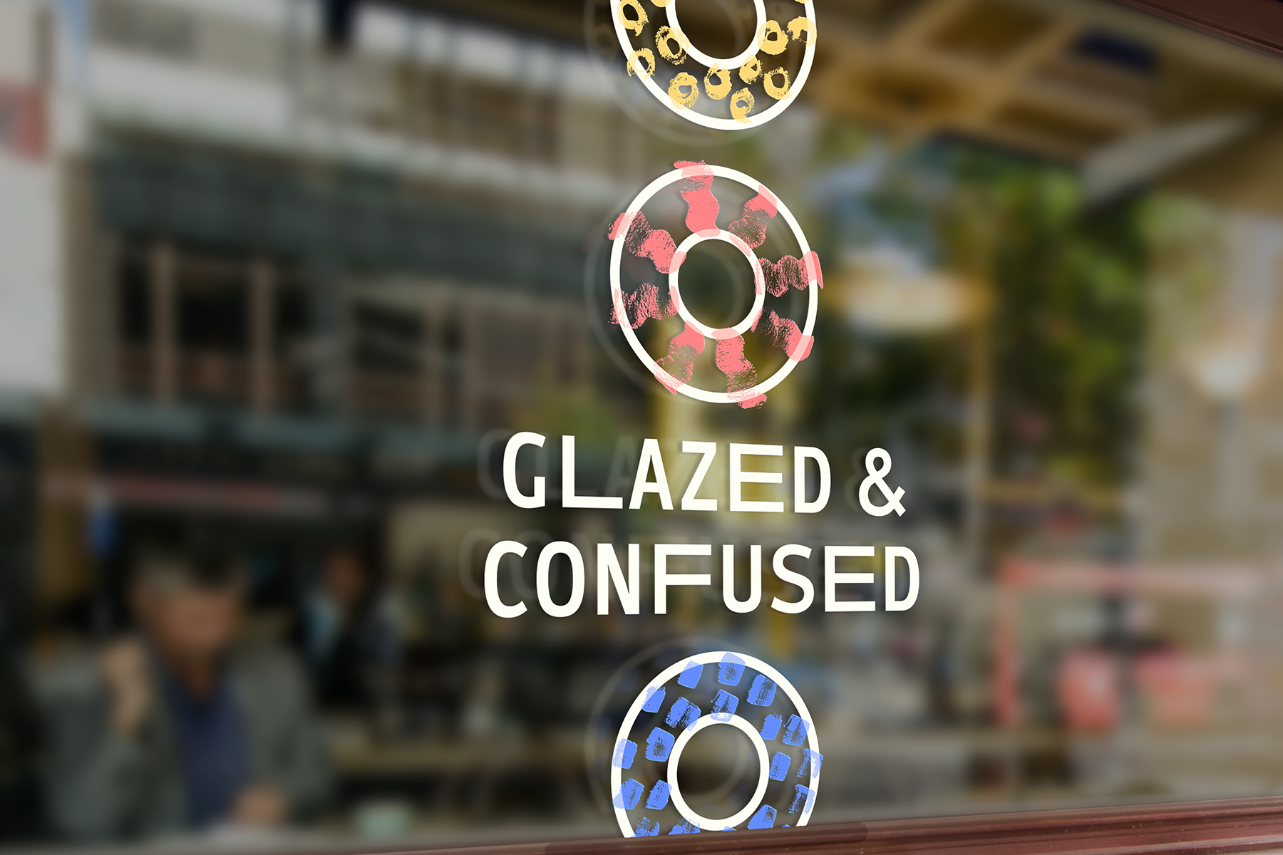
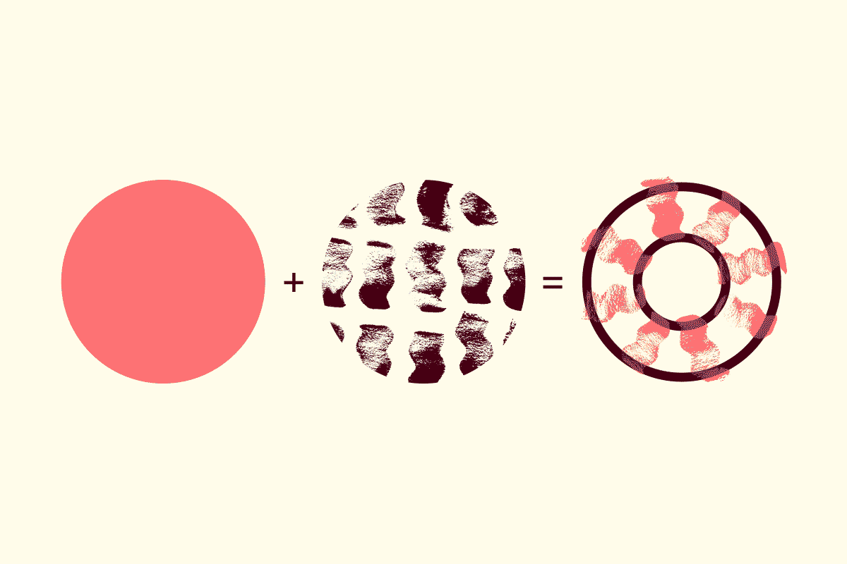
I wanted to create a visual identity that incorporates an aspect of hand-made authentic donuts that are produced in front of you right in the store. The brand should also represent the variety of different donuts and be flexible enough to work for new flavour combinations you might not have expected – A place to send your taste buds on a little journey and enjoy a sweet treat with a good cup of coffee.
SOLUTION
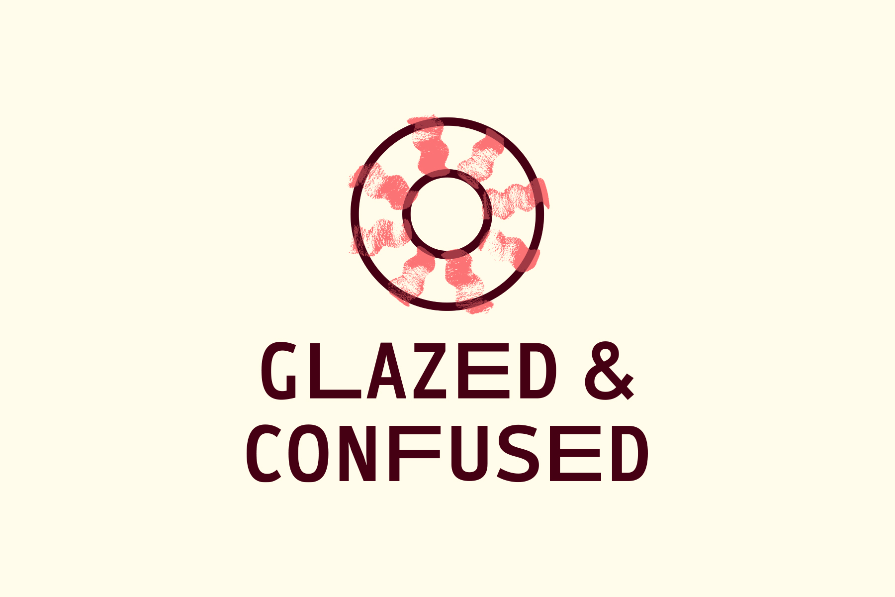
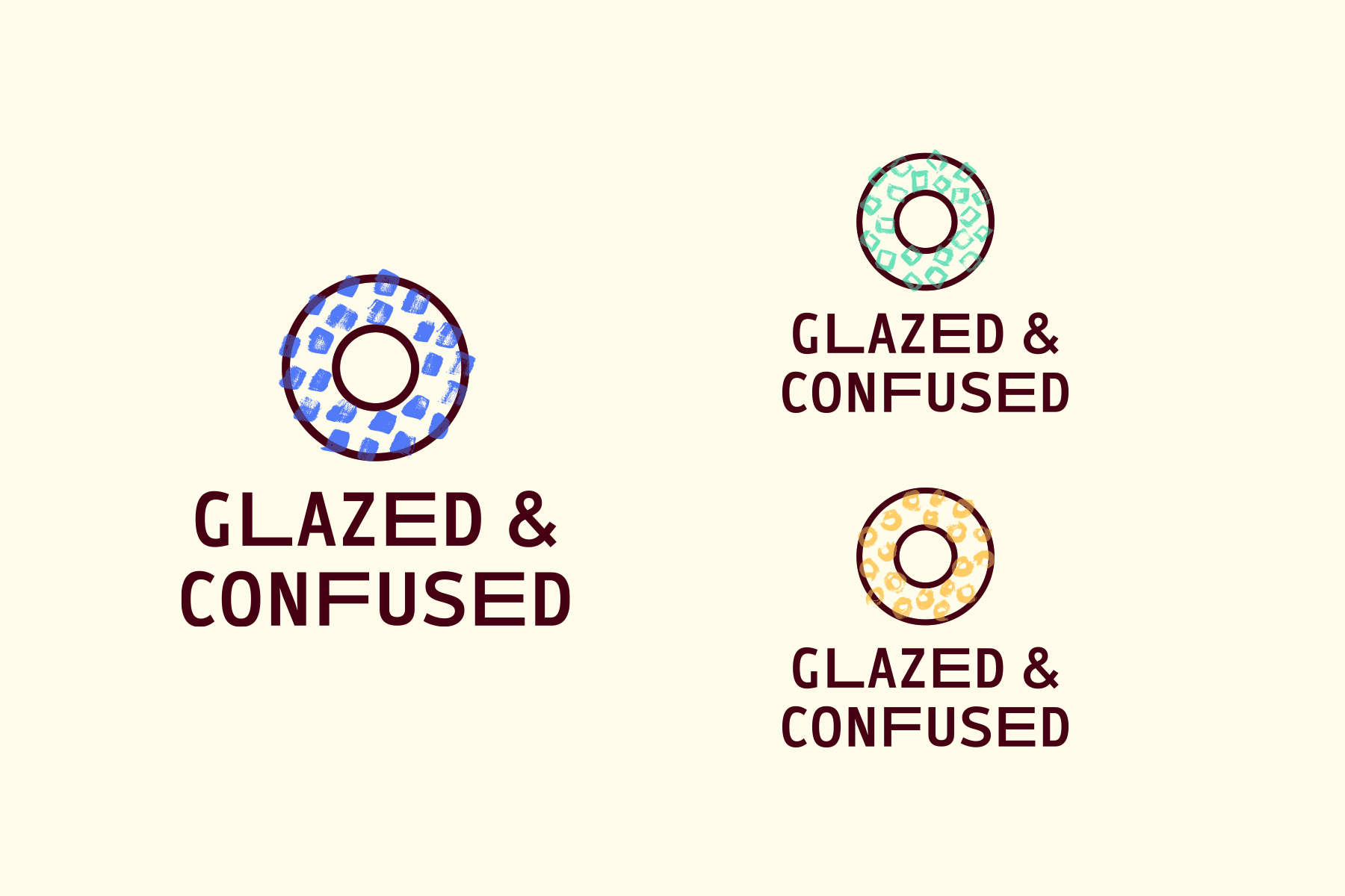
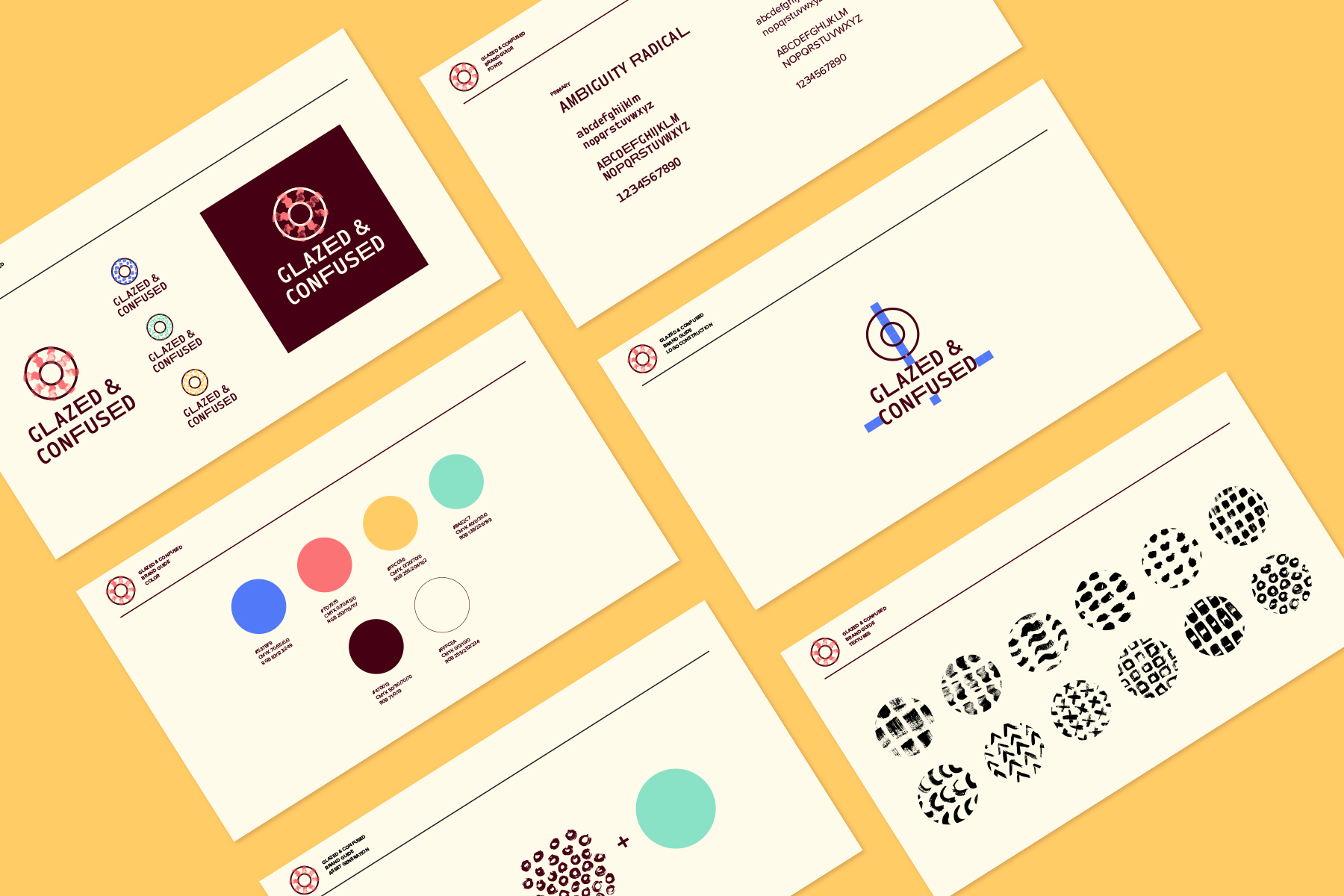
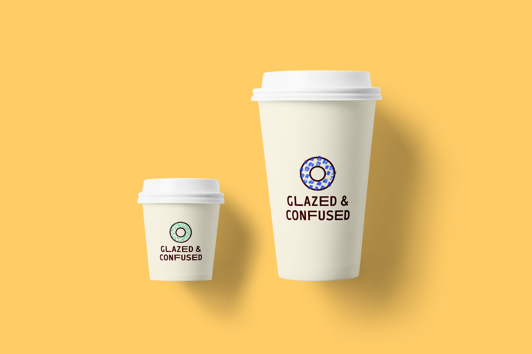
I started by focusing on the handmade quality of the goods and created the visual branding around it. I used hand-drawn textures to fill and “decorate” the donut shape. In combination with the playful colours, I managed to create a dynamic branding system that can be expanded on for any number of new sugary treats. Style elements can be easily generated even on the fly, which gives the brand the opportunity to evolve over time, keeping the packaging and other applications as fresh and new as the goods themselves. For the logo, I decided on the font Ambiguity Radical. To emphasize the whimsical nature of the brand, some letters of the typeface are stretched and extended, like an unexpected flavour that might leave you confused for a second before you take a second bite.