The Good News
PRODUCT
Branding / Visual Identity / UI-Design
The Good News is, as the name suggests, a brand for a news outlet focusing exclusively on all the positive happening in the world in an attempt to combat the almost overwhelming negativity that has taken over the headlines and reports recently.
CONCEPT
The idea for this brand was born out of sheer frustration. As of late, most of the news you see are quite grim and negative, focusing on worst-case scenarios to get people to click and share. We are almost tempted to forget just how much good is happening in the world, waiting on the edge of our seats for the next shoe to drop. It is easy to forget that so much good, big and small, has happened in the last decade alone ‒ from a significant reduction in child mortality worldwide to peace in long-time conflict zones to new and exciting scientific discoveries. Humans have never been healthier, wealthier or lived longer in all of recorded history. So, I decided to create a news outlet that focuses on the good in the world in an attempt to provide some positivity and restore some faith in humanity.
SOLUTION
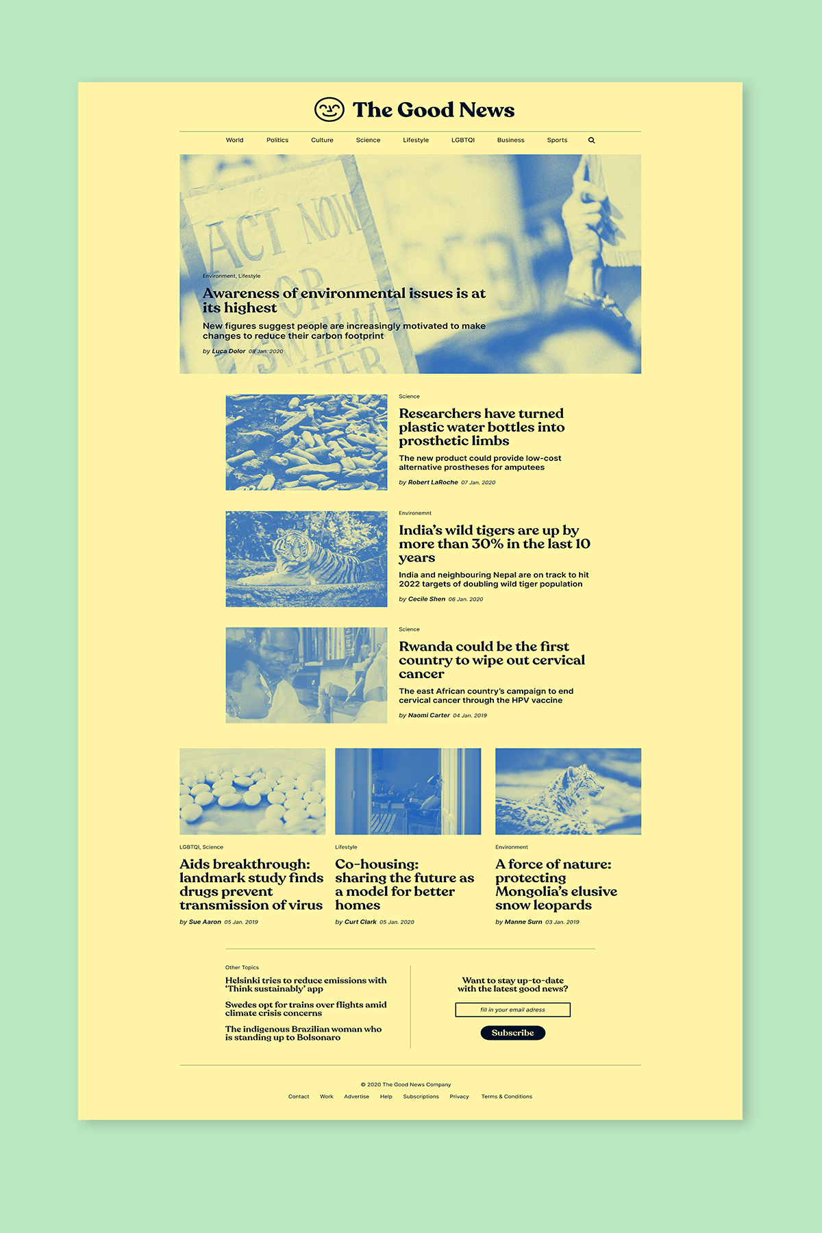
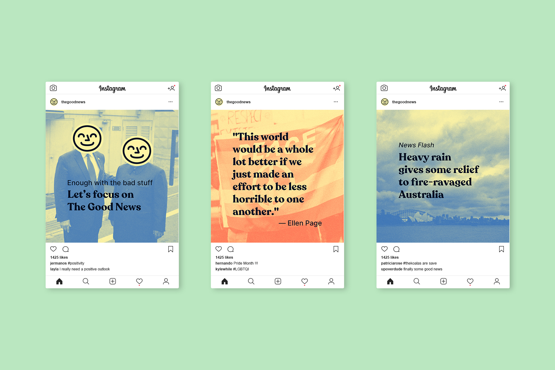
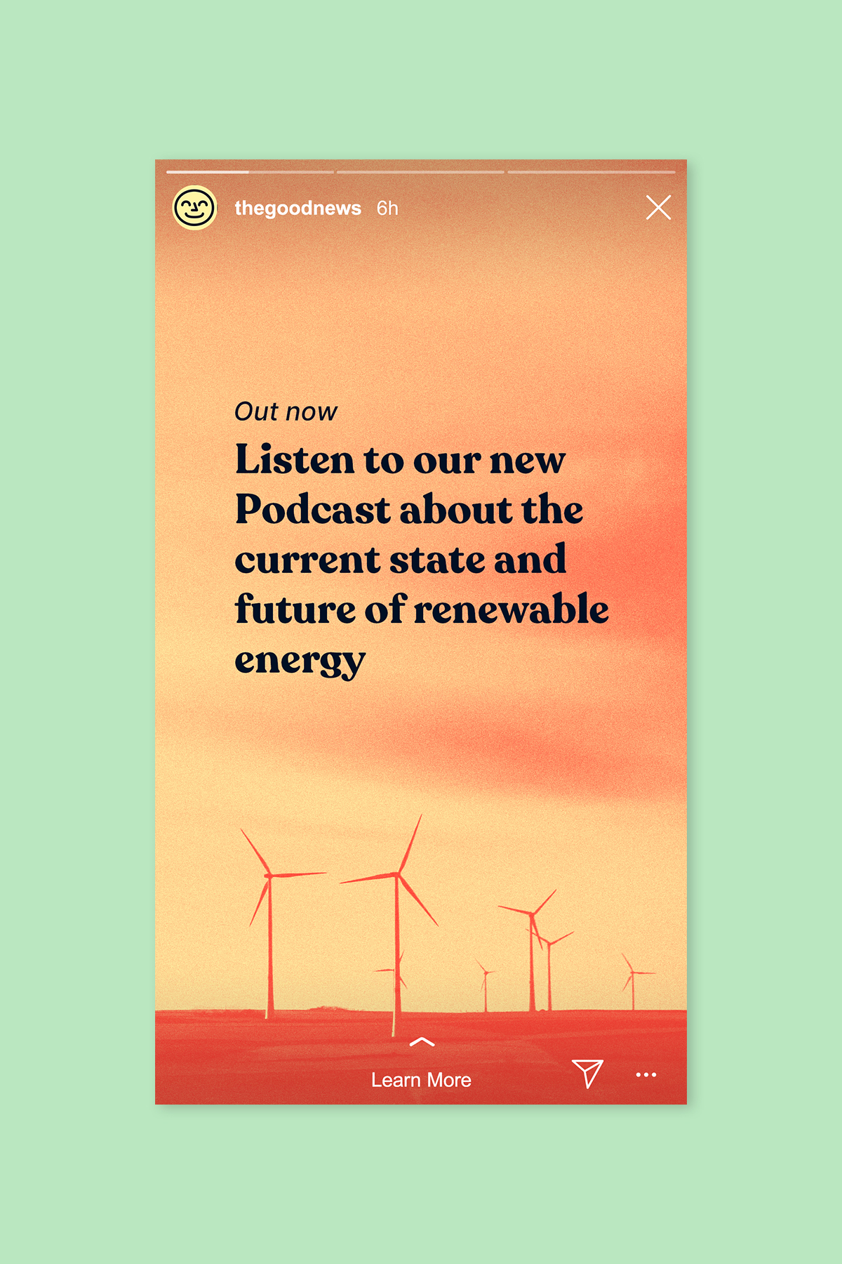
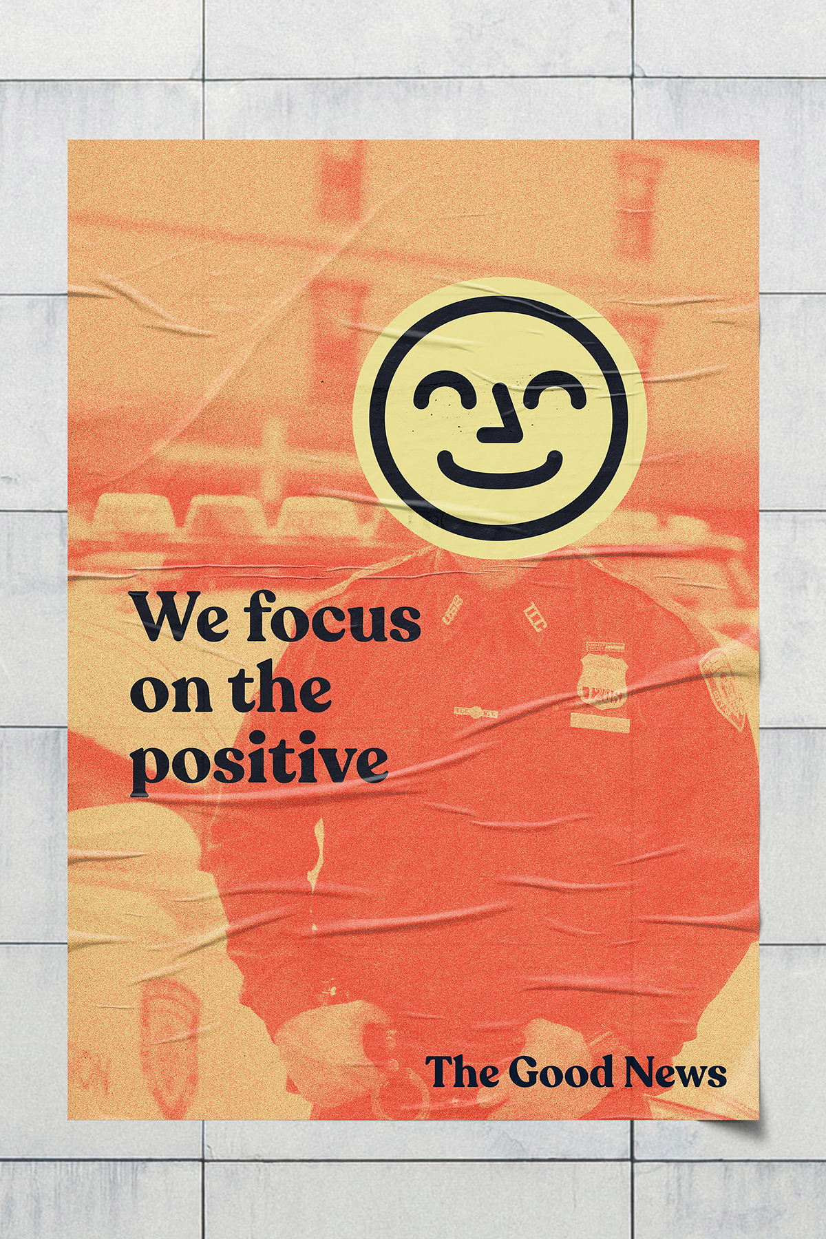
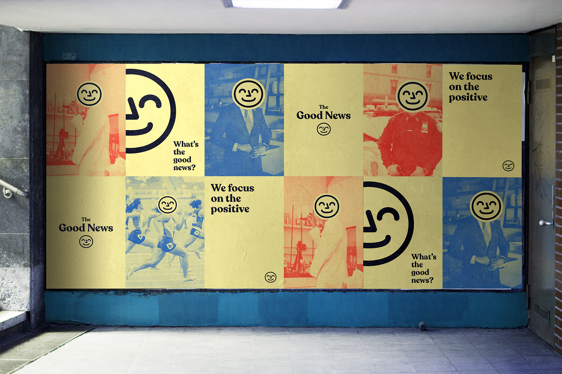
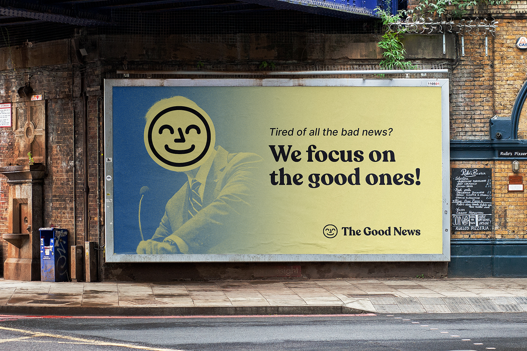
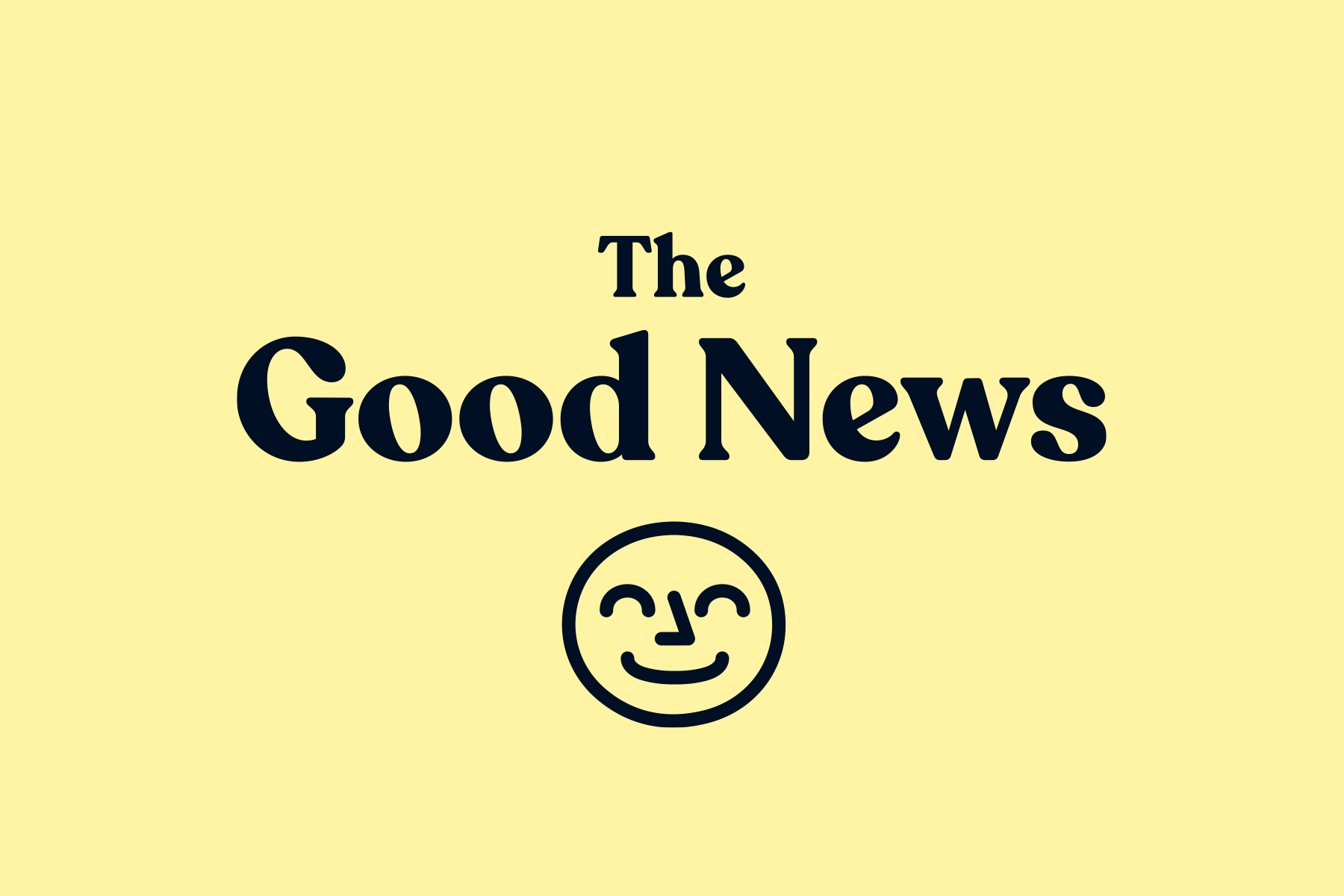
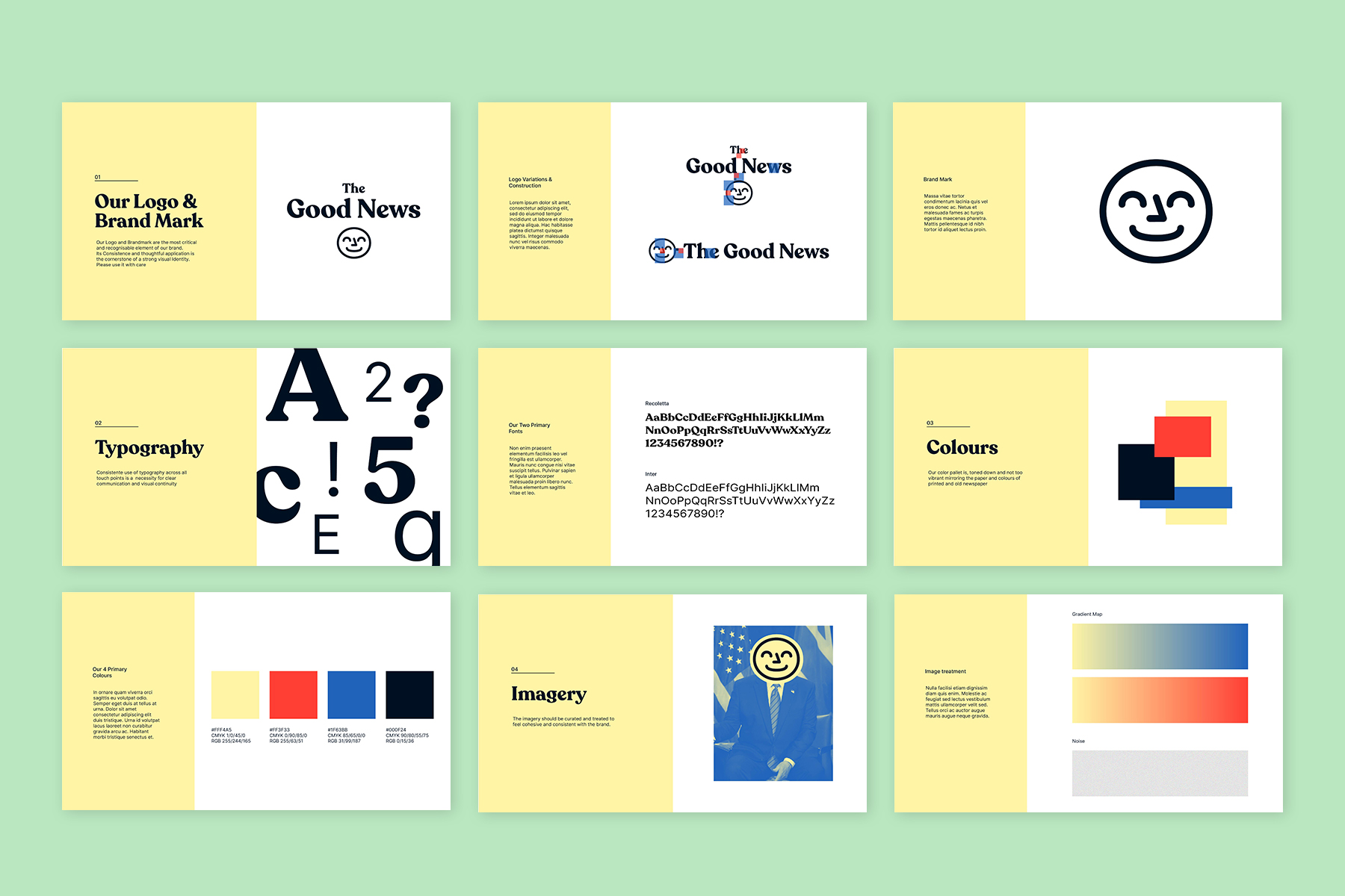
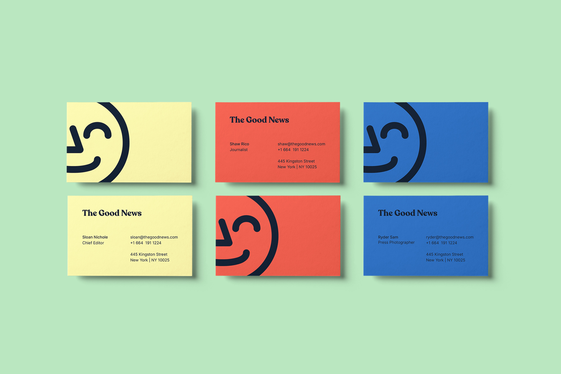
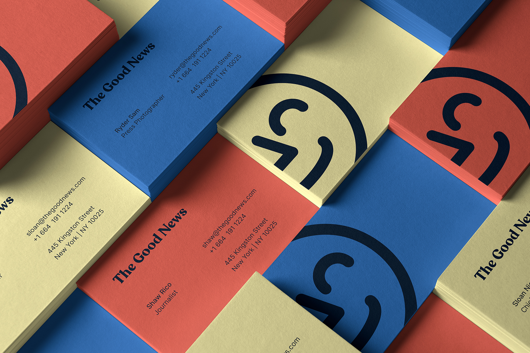
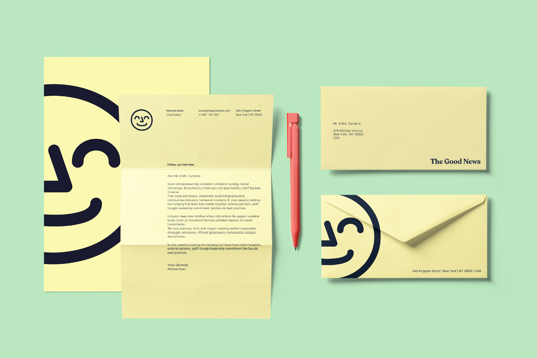
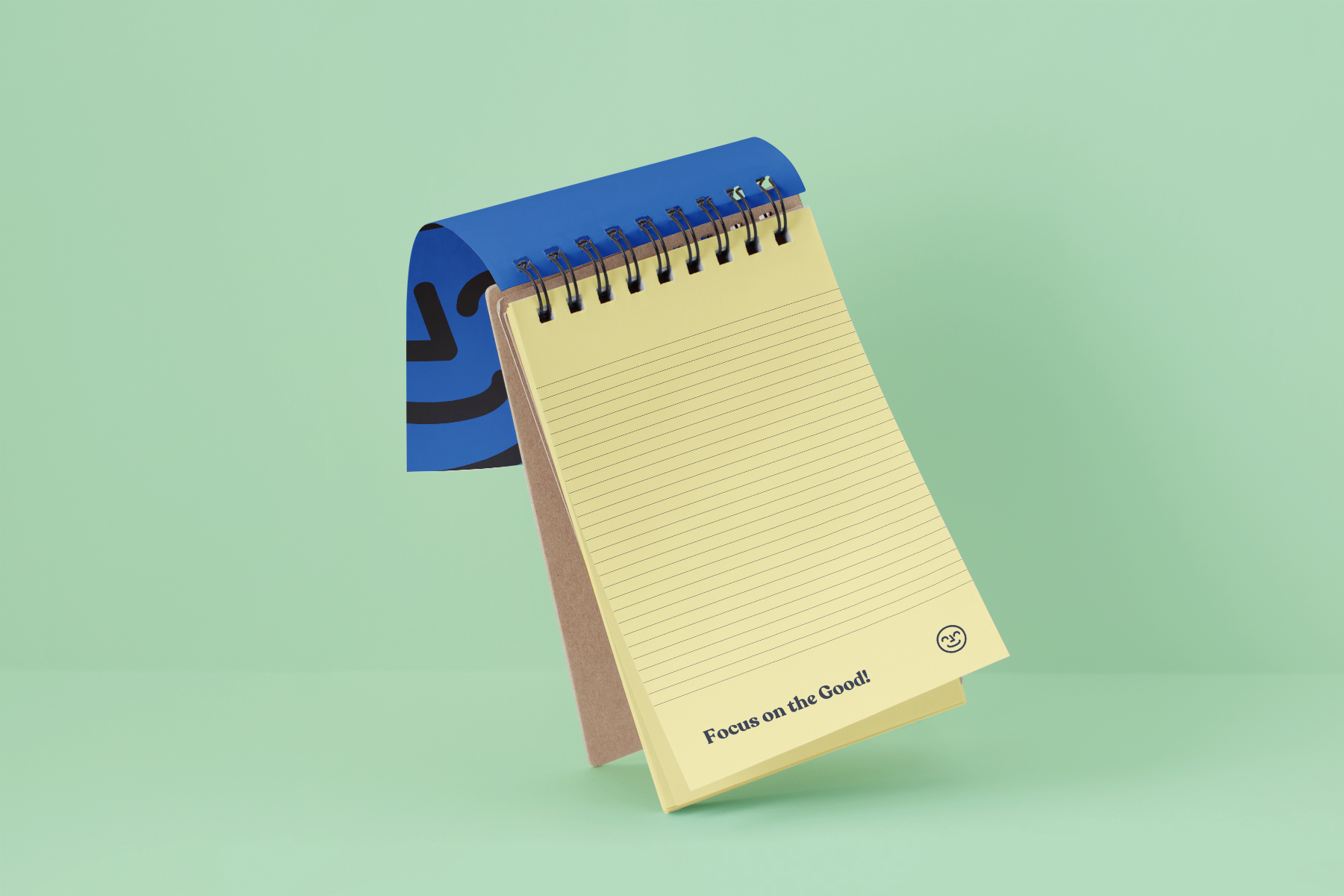
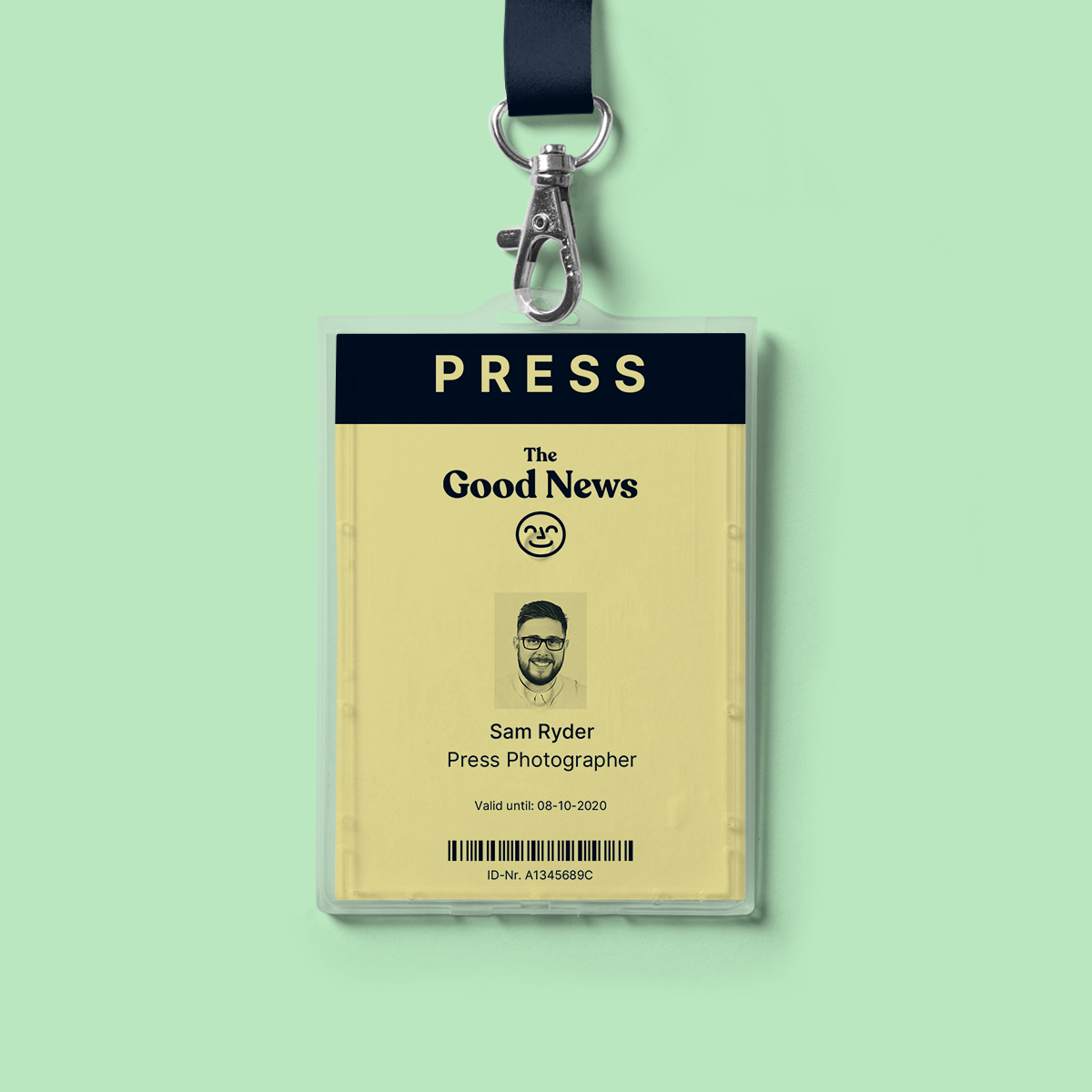
My goal was to focus on positivity while not overdoing it. The brand should still fit the serious, professional journalism of the newspaper. For the logo, I decided on the font Recoleta with its soft serifs that contrast the blackletter and hard fonts of most newspapers while still giving it a somewhat nostalgic, dignified and established feel. The brand mark, a smiling face, was created to further convey the idea of positivity. It can be used with the logo typography, on its own or as a style element for collateral and ads.
The colour pallet was inspired by old newspapers with yellow as the primary colour for a more positive feel and a vibrant red and blue to set the necessary accents.
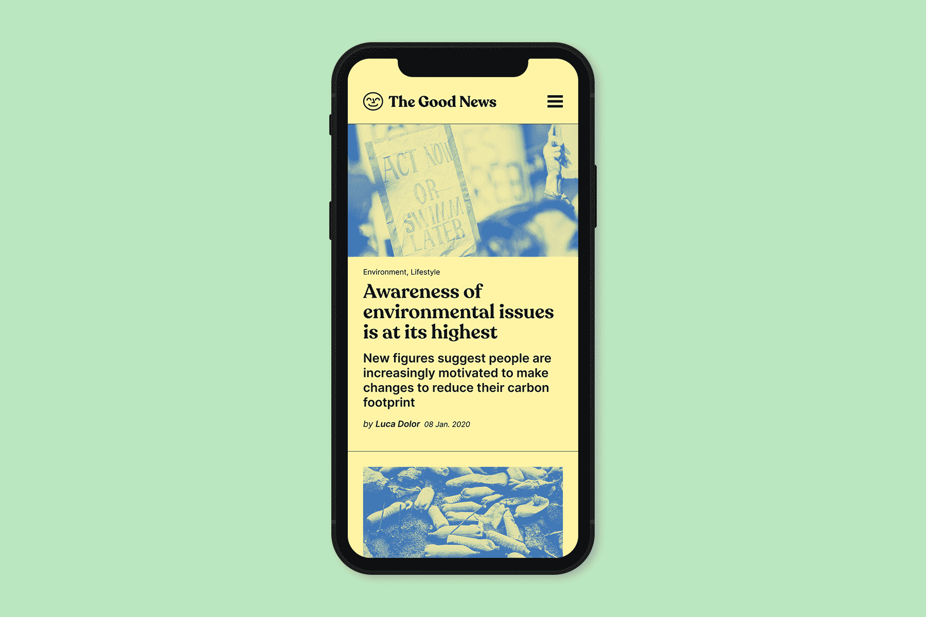
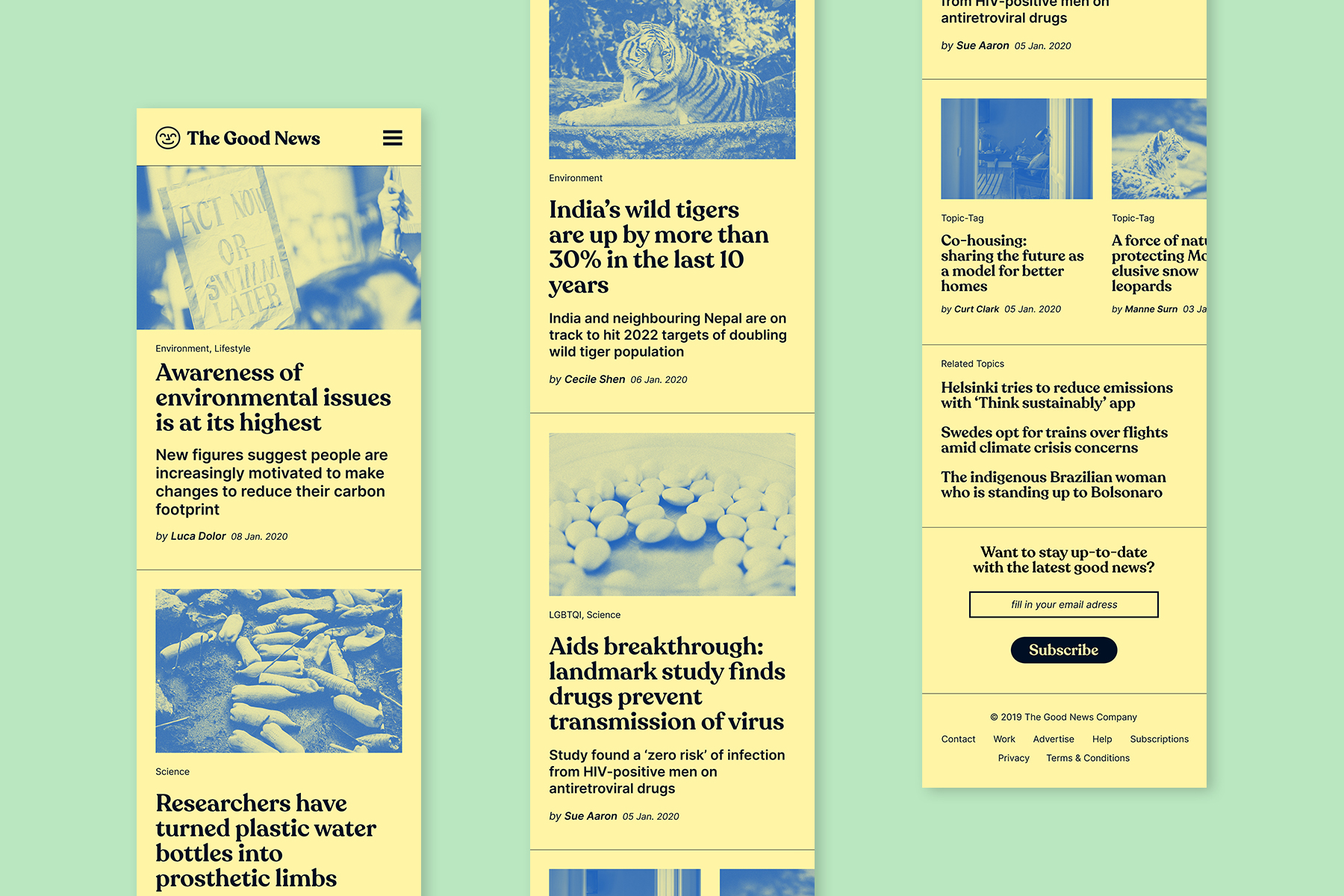
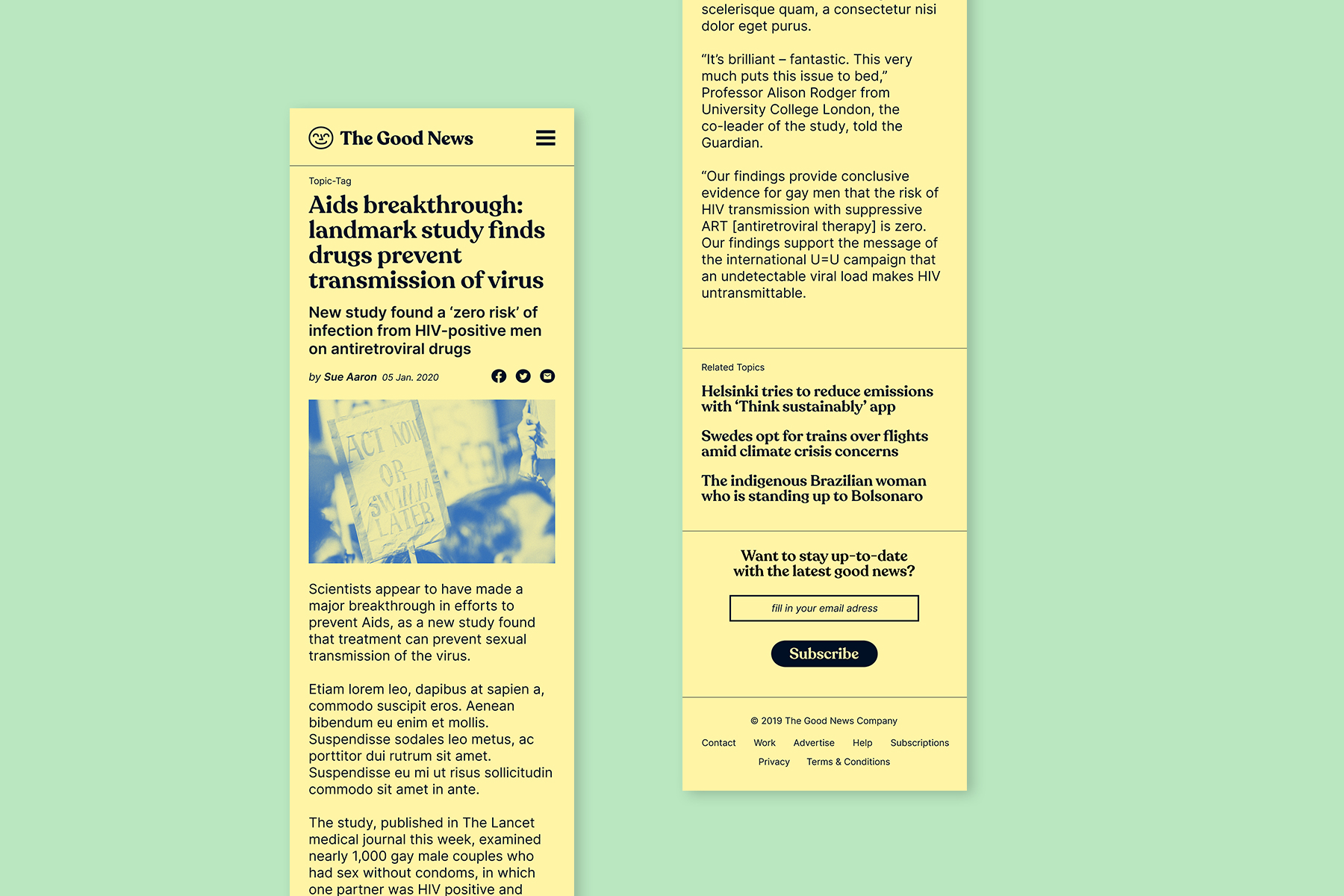
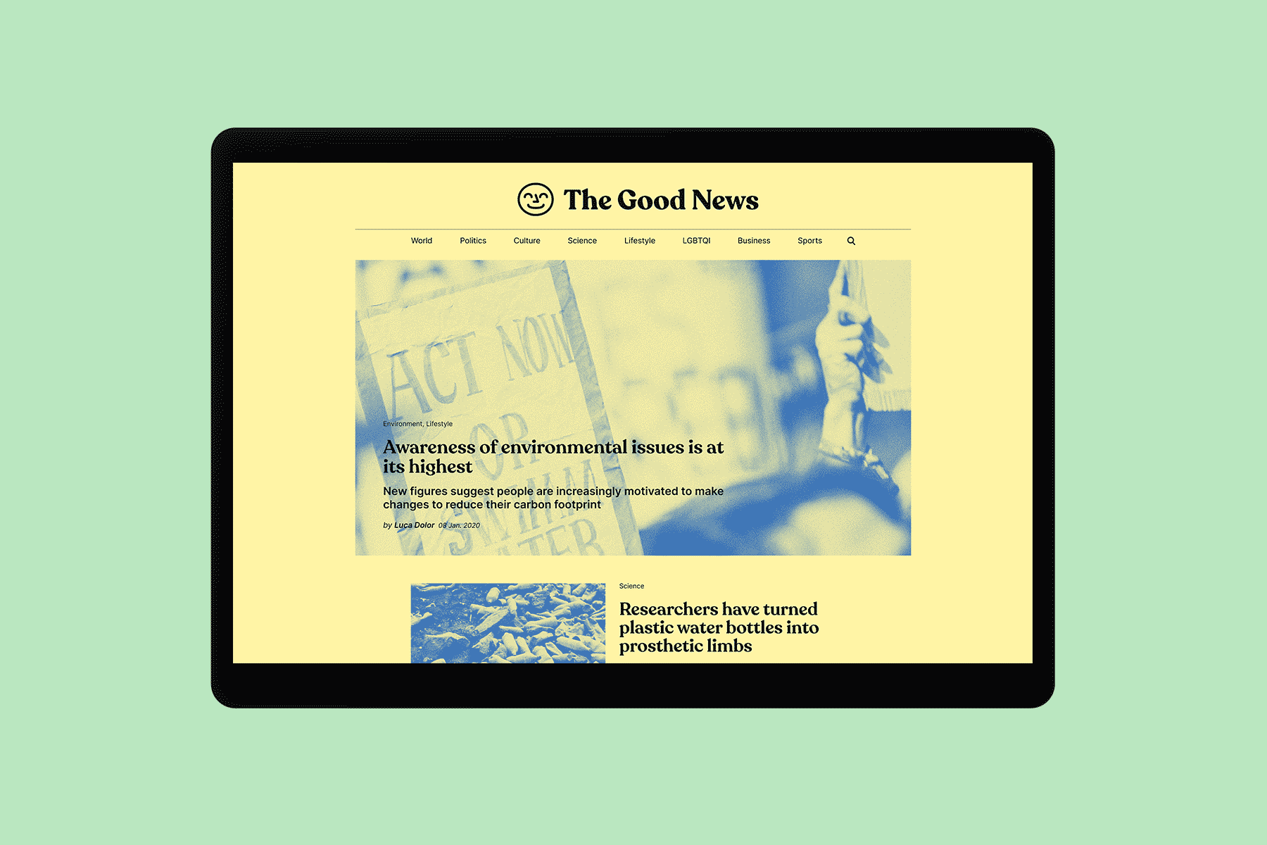
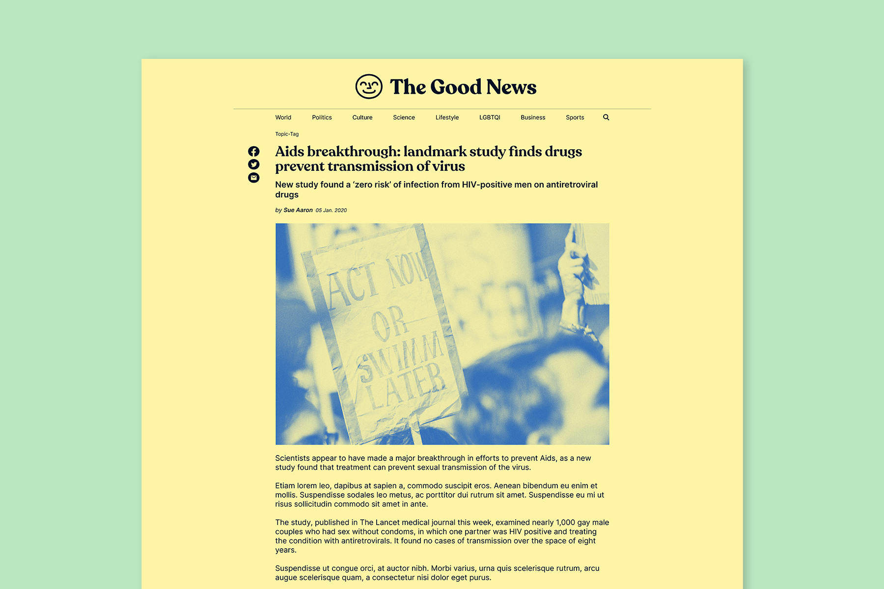
In this day and age where it is easier to spread news via the internet than a physical medium like paper, I opten for designing a web-based newspaper. This clear and structured webpage stands in stark contrast to most news outlets, which tend to have a rather crowded and overloaded website. The challenge here was to filter out all information required for the article to be posted (author, date, categories, etc.) and to display all this information in an easily graspable way. The font Inter was used to ensure optimal readability on web and devices. By keeping the images in duotone so that they do not distract too much from the articles itself, I can reap the added benefit of differentiating the Good News from other newspapers, as they mostly use full-colour images. This style is also transferred to other content like social media and print campaigns.