Modular Reusable UI Component Library
Design system, UI components, tokens, accessibility
This self-initiated project is a modular UI component library built in Figma and aimed at streamlining future design work. It combines frequently used interface elements with flexible component structures and a scalable token setup, making it easy to adapt across different brands or projects.
Role
UI Designer, concept
Team
Solo project
Contribution
Library structure, token structure, UI components, accessibility, scalability
Duration
2025

The Goal
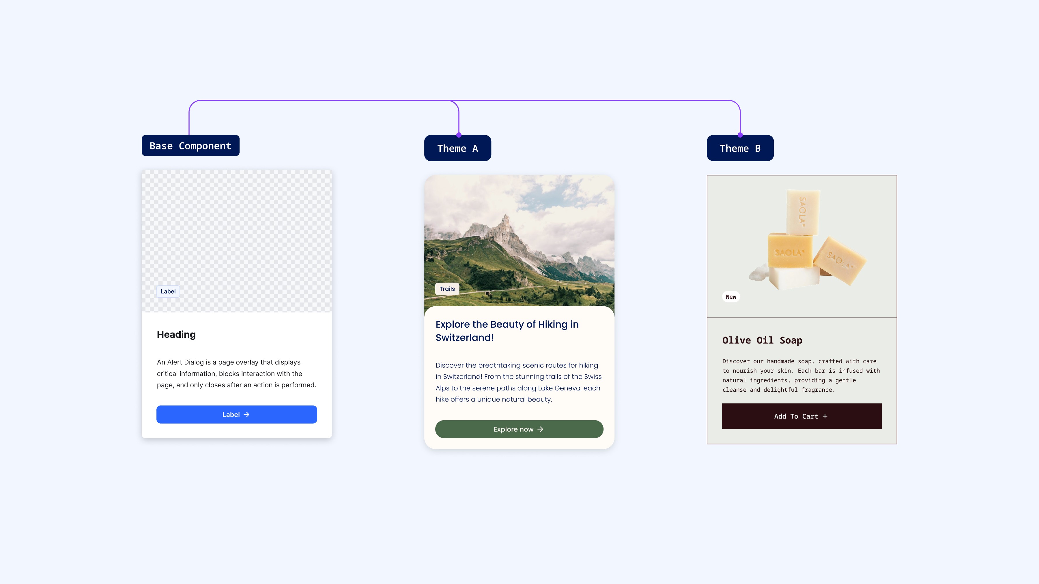
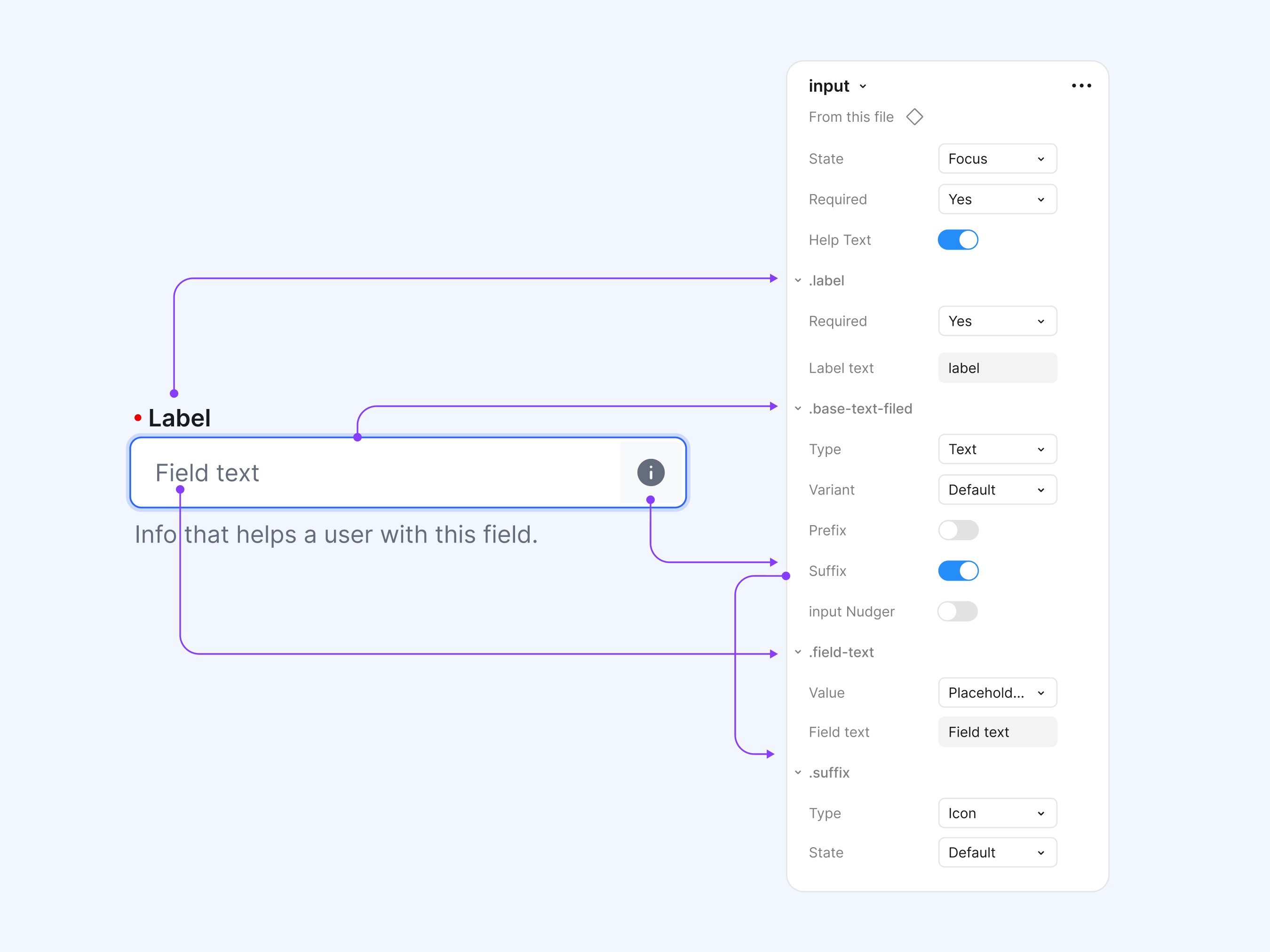
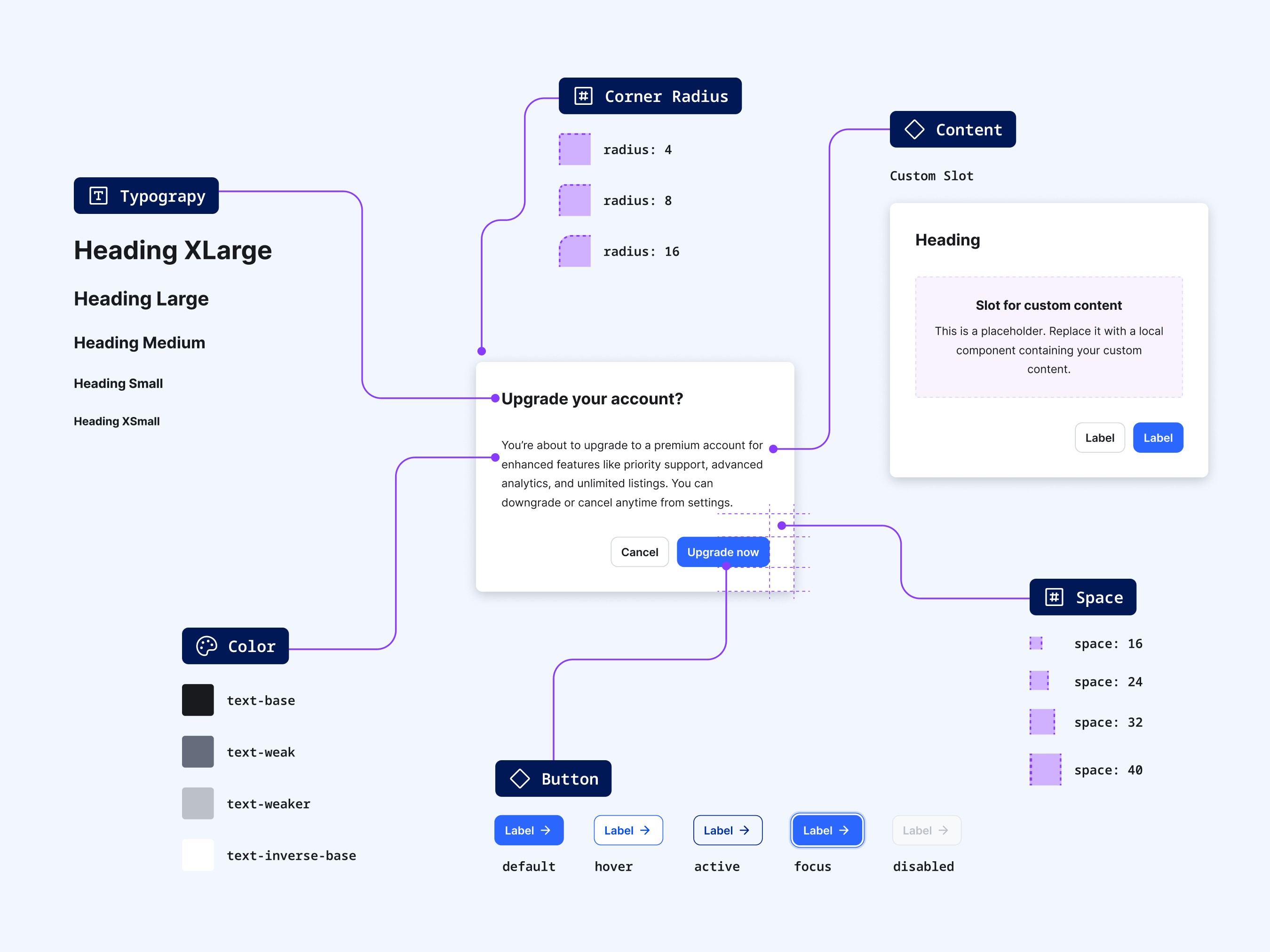
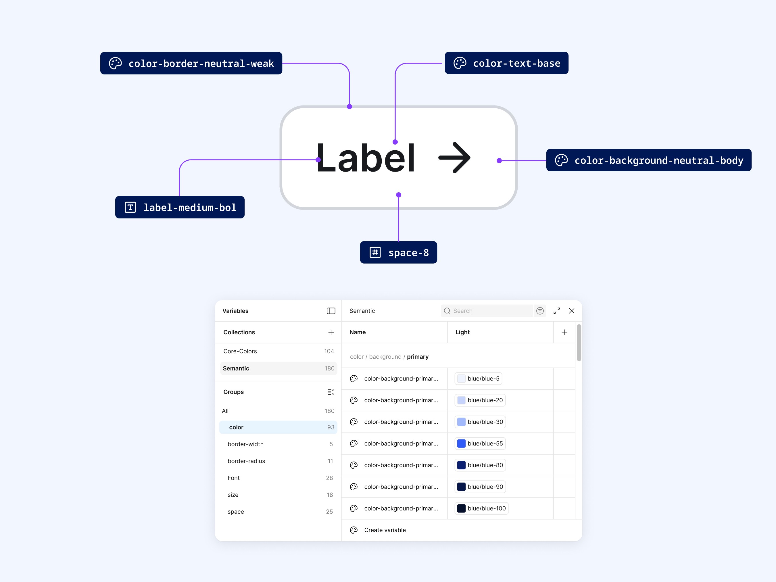
My goal for this project was to build a reusable and scalable component system that reflects best practices and speeds up future workflows. I wanted to create a reliable library of common UI patterns and modules, supported by semantic tokens and variables that allow for efficient customisation.
The Challenge
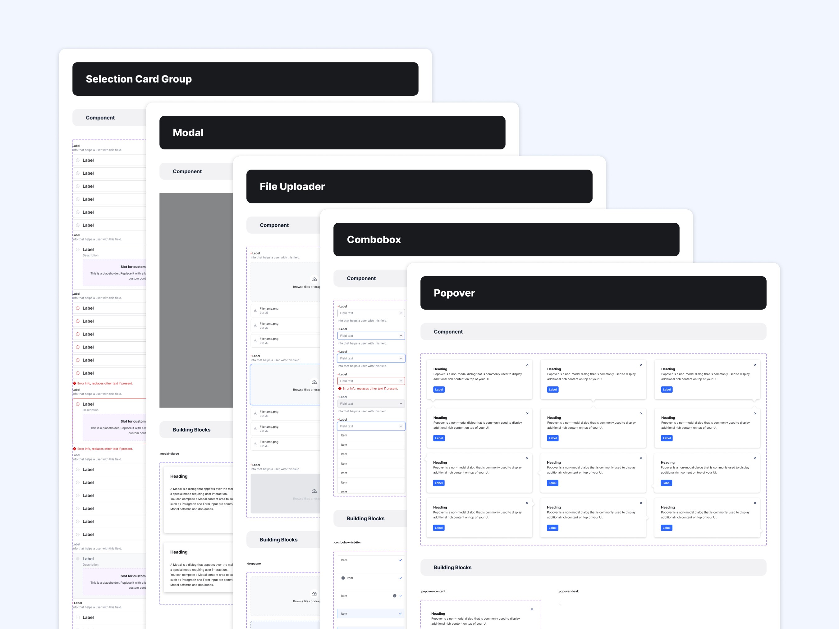
One of the main challenges was striking the right balance between flexibility and simplicity. I wanted each component to be easy to use and to adjust, without weighing down the system with unnecessary complexity. This required a high degree of intentionality with regard to component properties, keeping the naming scheme logical and focusing on those interface elements that are most commonly needed across different projects. Accessibility also remained a priority, thus I took structure and states into consideration from the start.
The Insights
Drawing on my experience building design systems for client projects, I identified the key components that frequently appear in UI work and built a library of 55+ components in Figma. The system includes a basic semantic token set and a starter icon library. I kept the structure clean and lightweight to allow for quick handoff and easy future updates. Plans for future iterations include adding dark mode support through extended theme tokens.