Grānō Salis
Branding, visual identity, UI concept, web design
Grānō Salis reimagines salt’s historical symbolism as a modern, poetic premium brand identity. This self-initiated project elevates “white gold” into a timeless visual system for an everyday staple with ritualistic appeal
Role
Concept, design
Team
Solo project
Contribution
Visual identity, concept, UI design
Duration
2024
The Goal
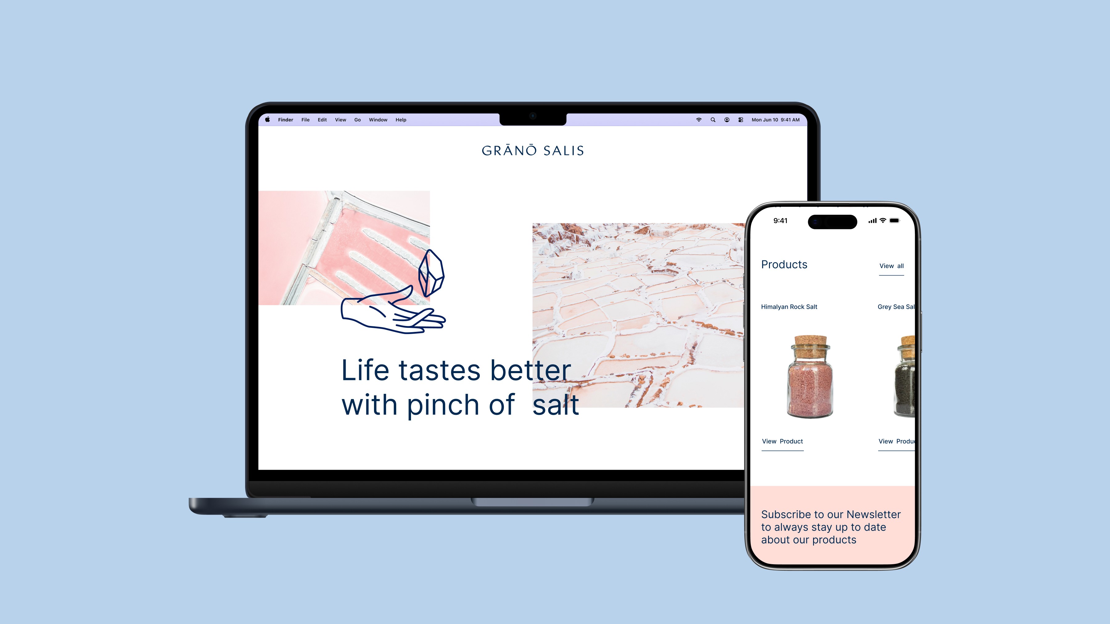
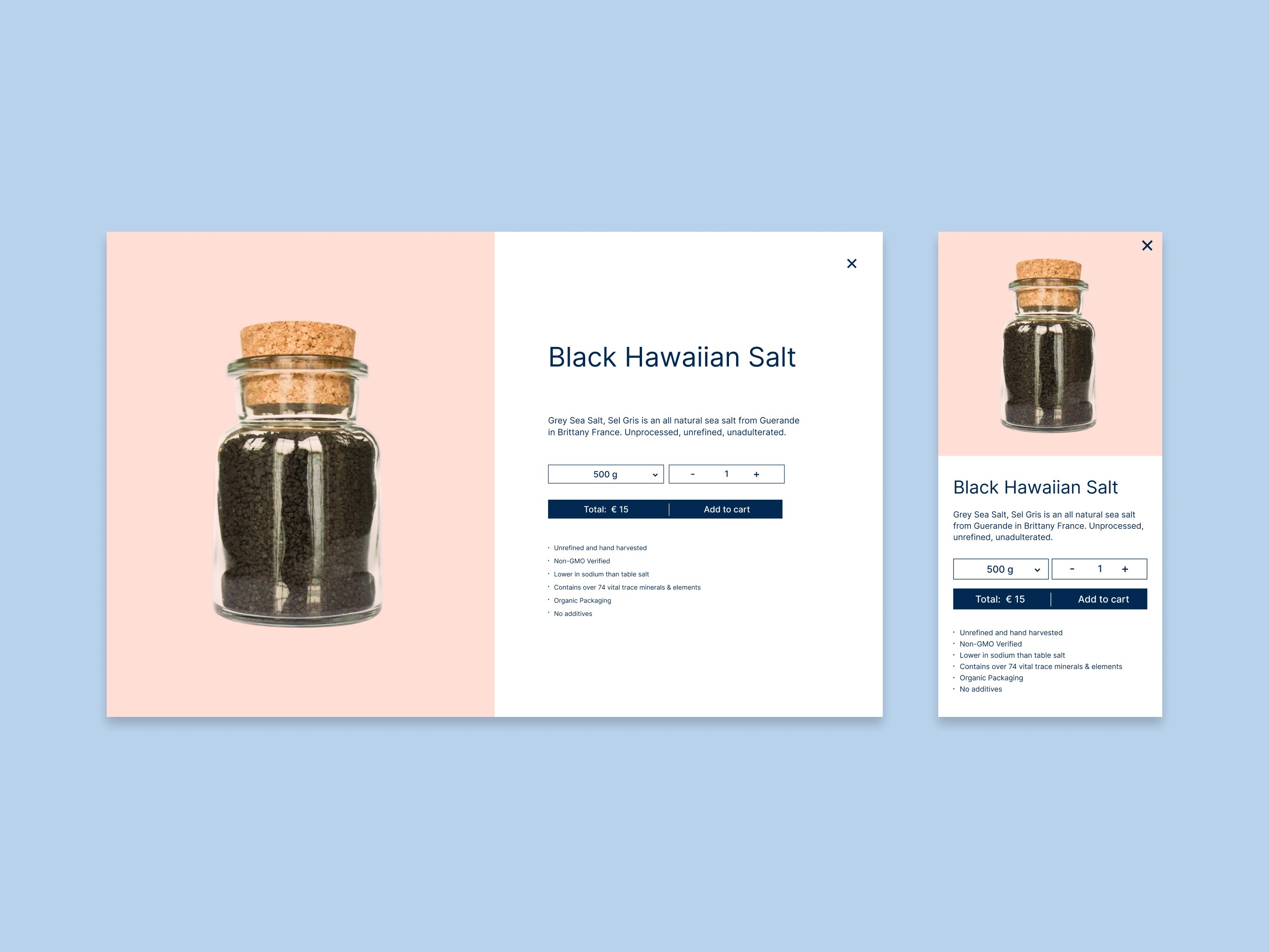
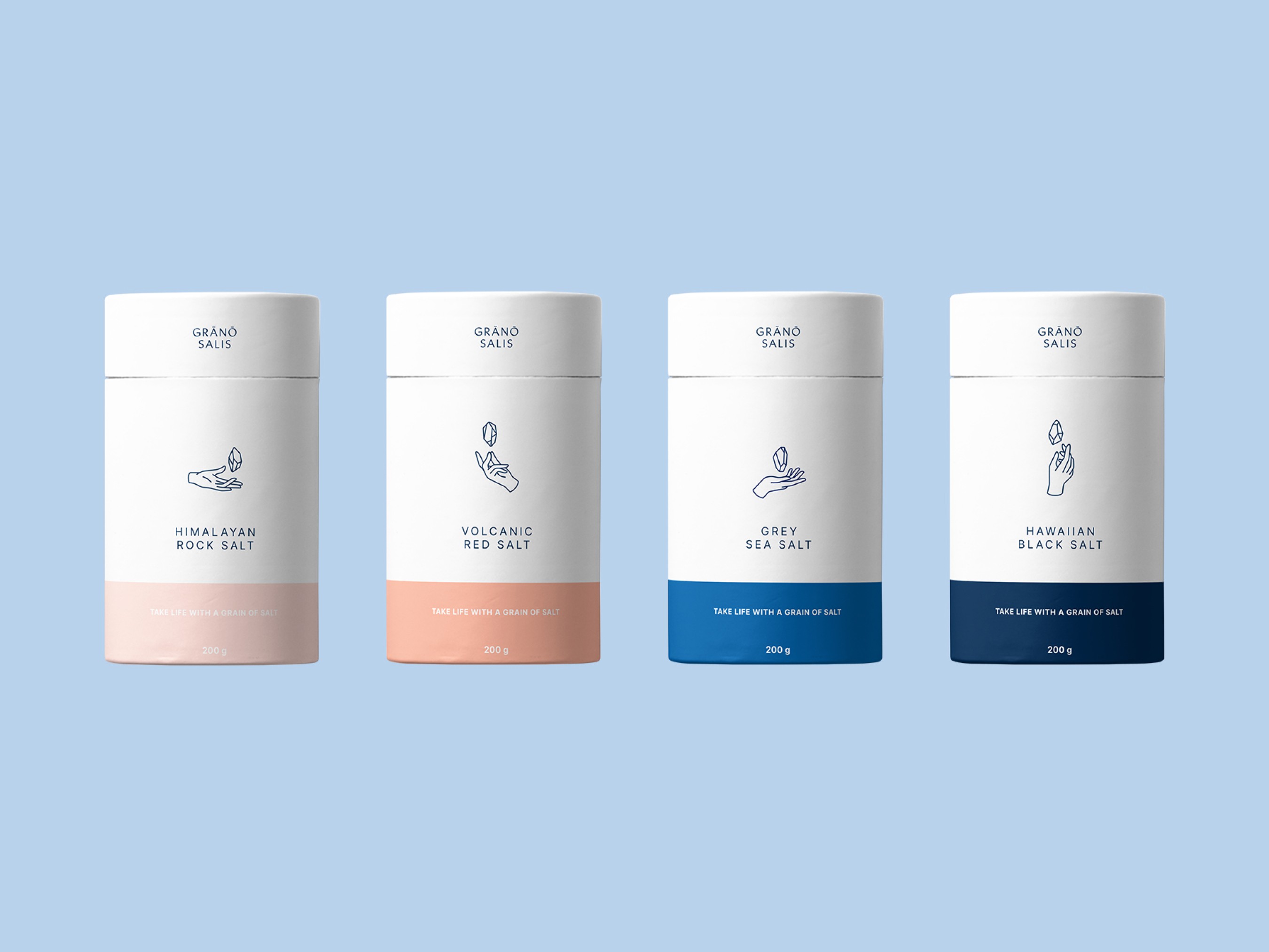
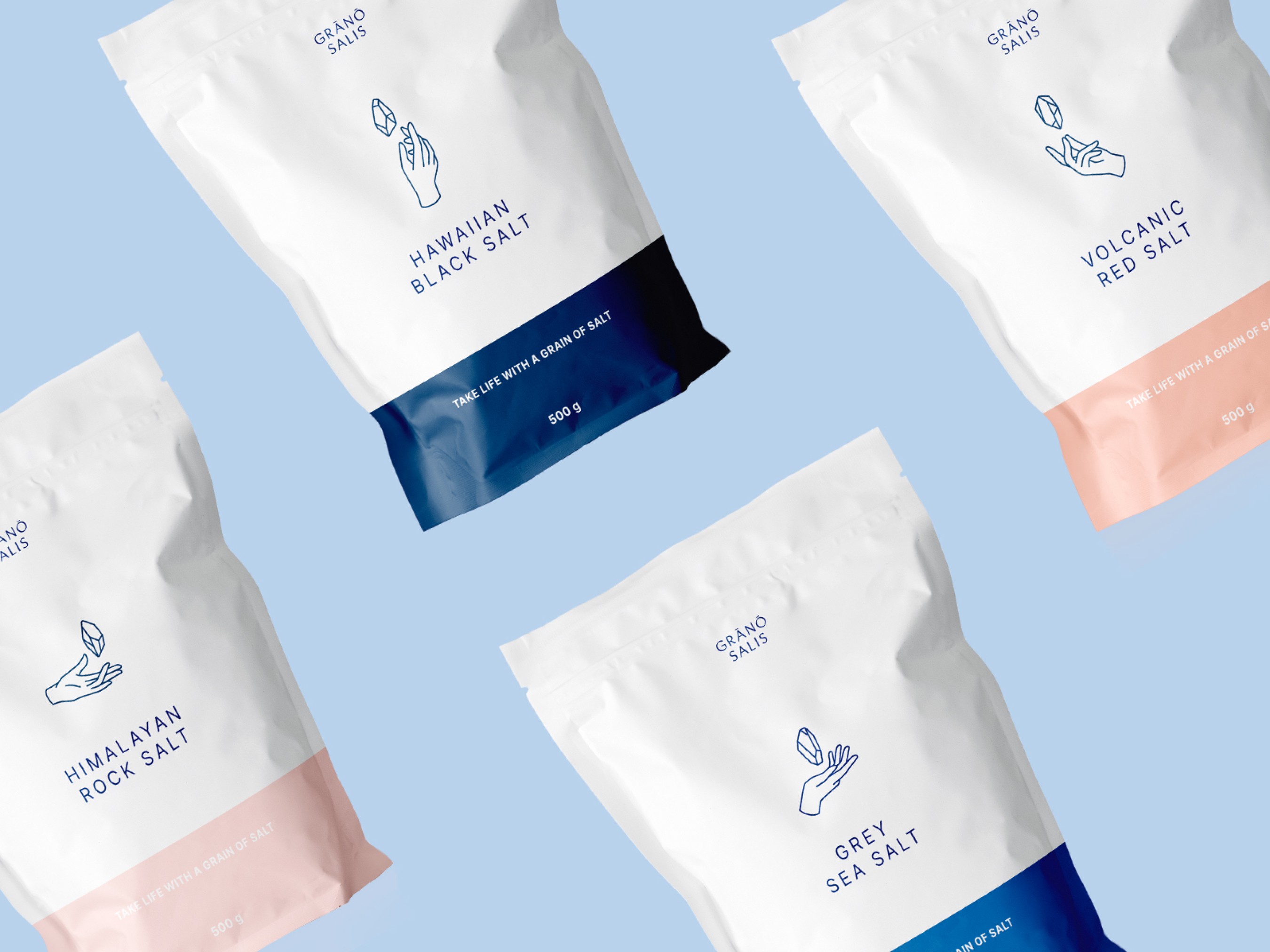
The primary goal was to develop a brand identity that elevates salt as both mystical and precious. It includes logo and brand marks, packaging concepts, a poster series, and basic website layouts inspired by salt as refined crystal to convey elegance, purity, and accessibility across touchpoints. The project explored concept-driven storytelling with a clean visual execution, blending UI and branding skills.
The Concept
Grānō Salis restores salt’s lost significance – from sacred rituals and currency to everyday kitchens – positioning it as a transformative crystal that enhances eating as a ritual. The design draws from nature, history, and minimalism to recapture its ancient elegance, celebrating salt beyond seasoning. It emphasises visual identity with supportive digital concepts to create a resonant premium experience
The Results
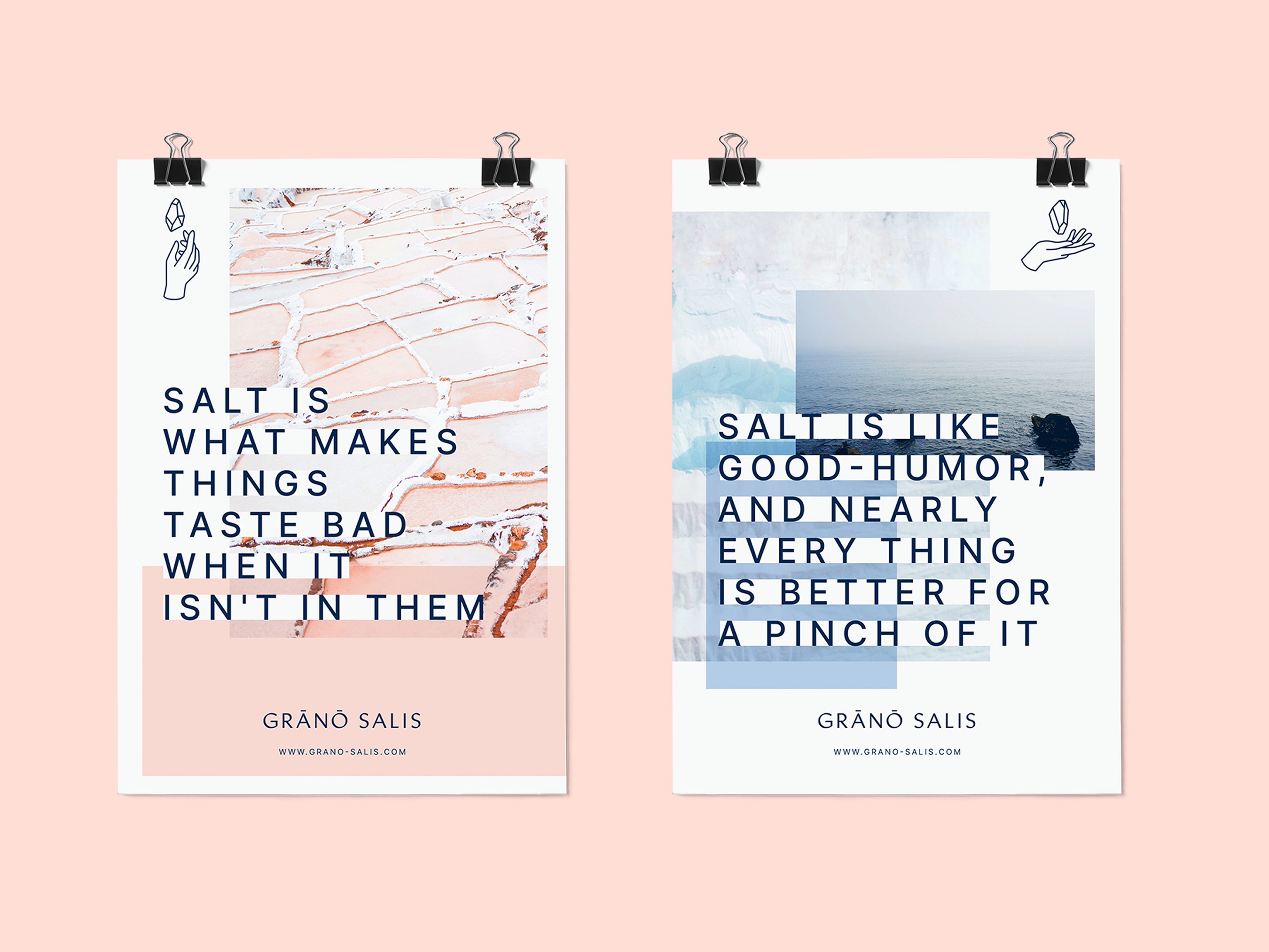
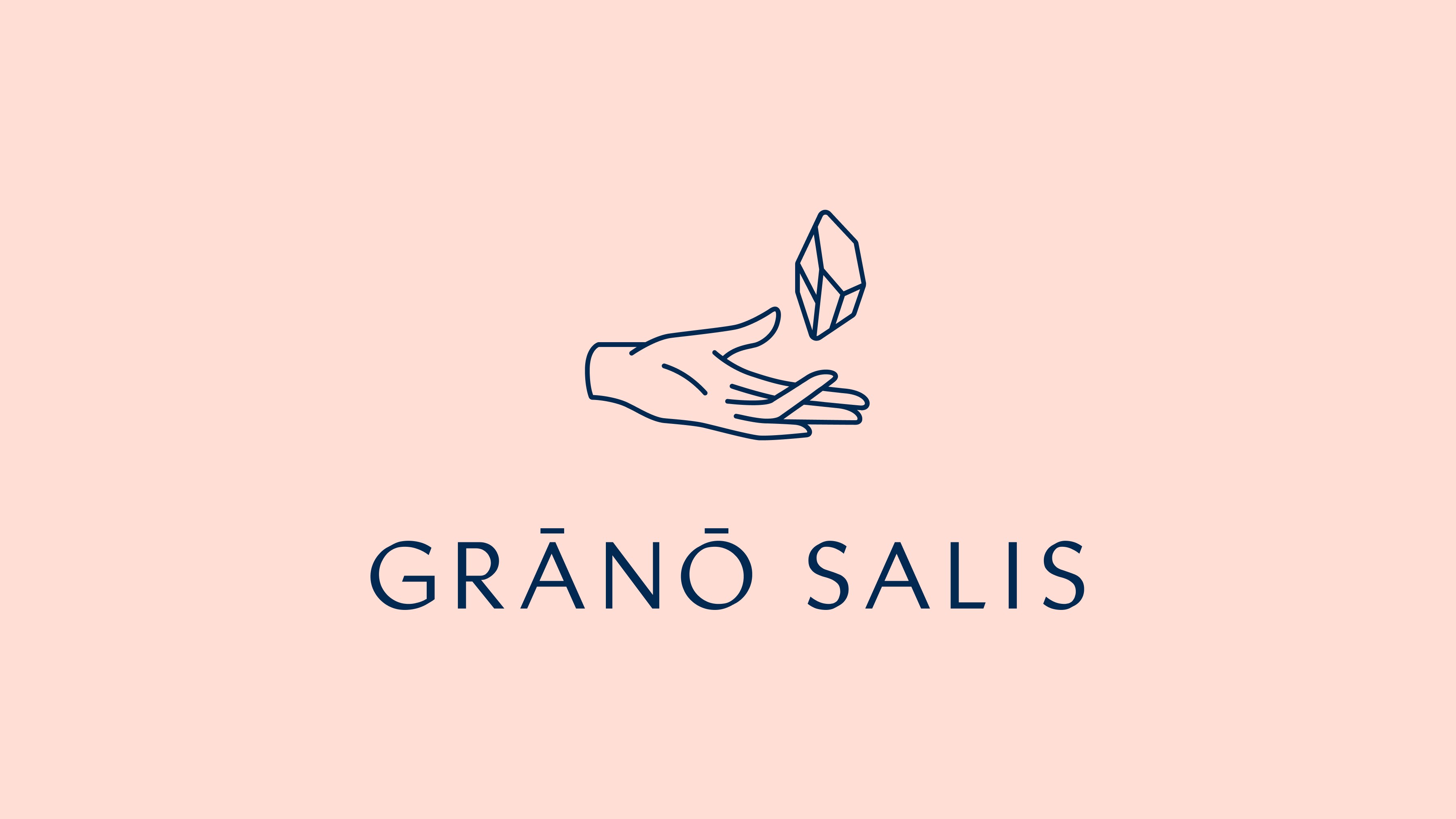
Salt grains were photographed and traced to form crystal-like motifs, paired with hand gestures for a dynamic visal language across packaging and branding. A custom logotype based on Linotype Brewery Medium echoes organic geometry, with a minimalist palette of ocean blue and Himalayan pink referencing its natural sources. The outcome is a clean, elemental identity system ready for print, digital, and physical applications.