The Good News
Branding, visual identity, UI concept, web design
The Good News is a concept for a digital outlet that focuses exclusively on uplifting stories. As a solo project, it combines branding and interface design to create a clean, editorial UI and a distinct, optimistic visual identity.
Role
Concept, design
Team
Solo project
Contribution
Visual identity, concept, UI design
Duration
2024
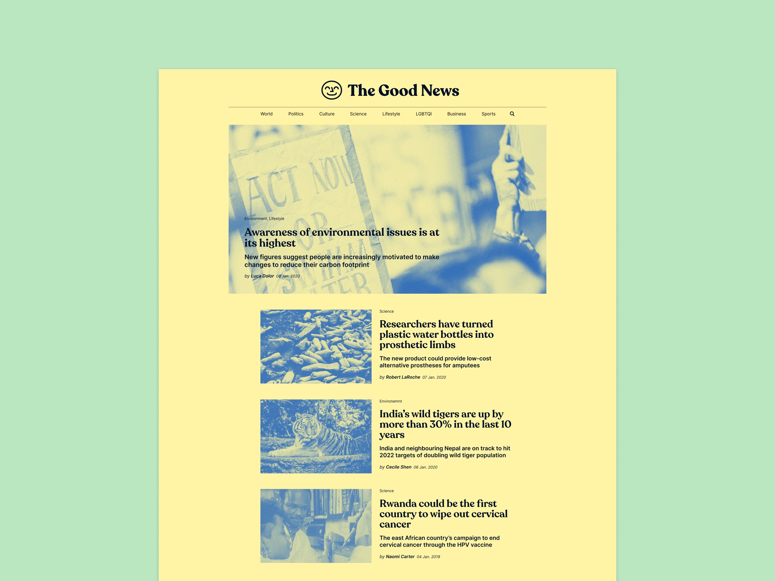
The Goal
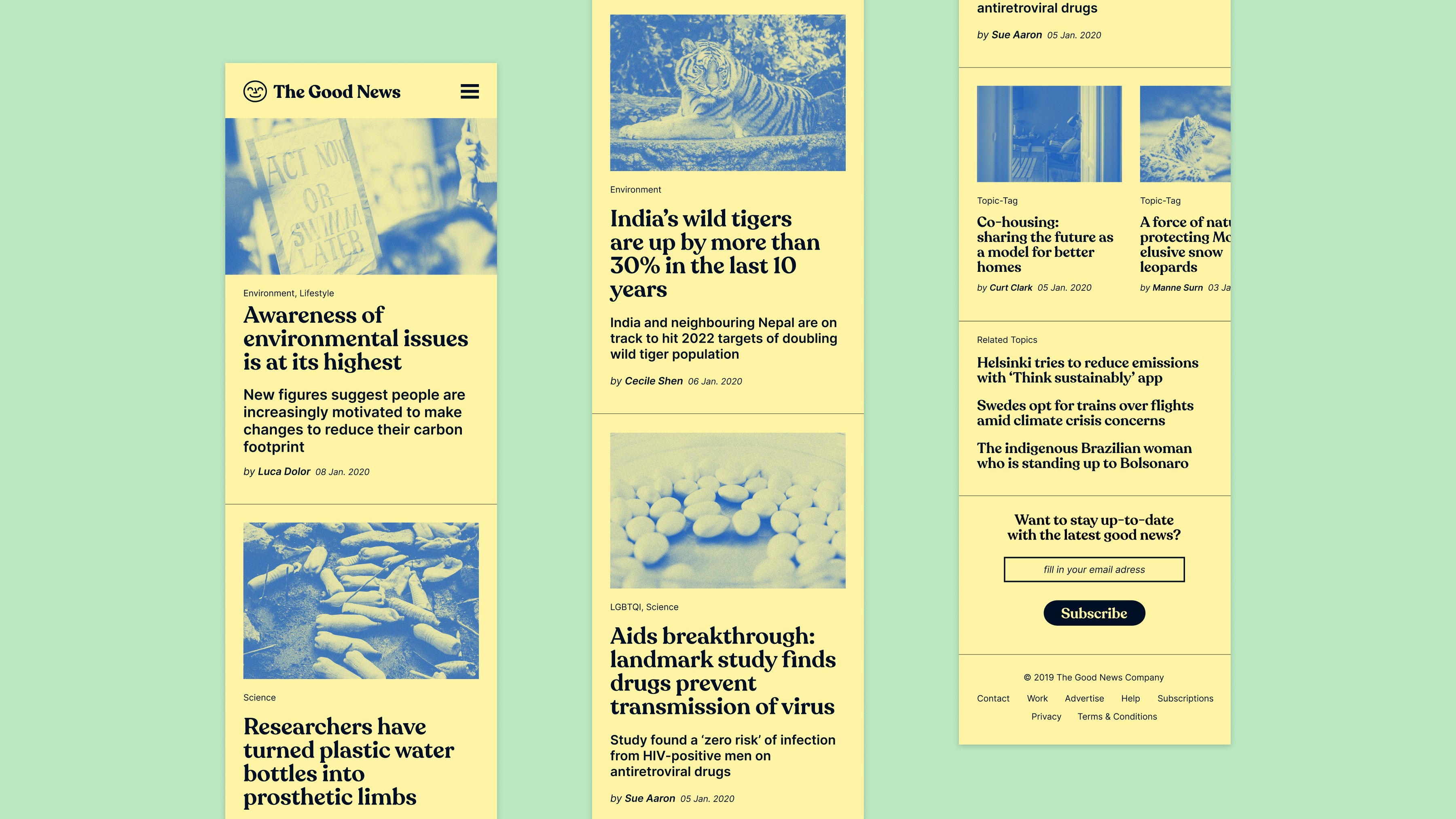
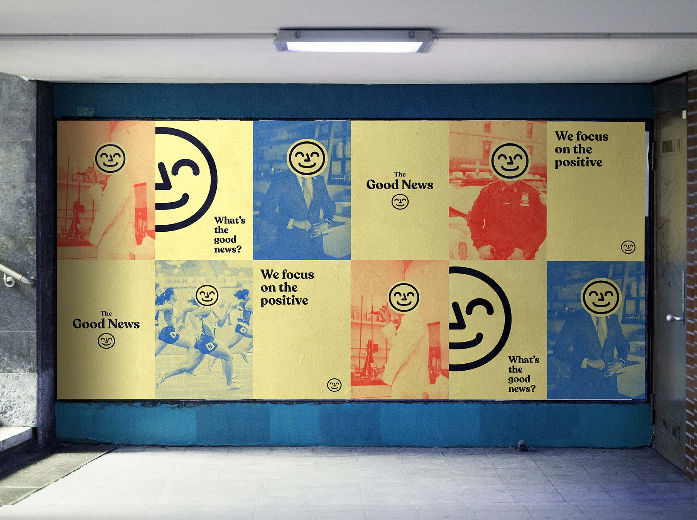
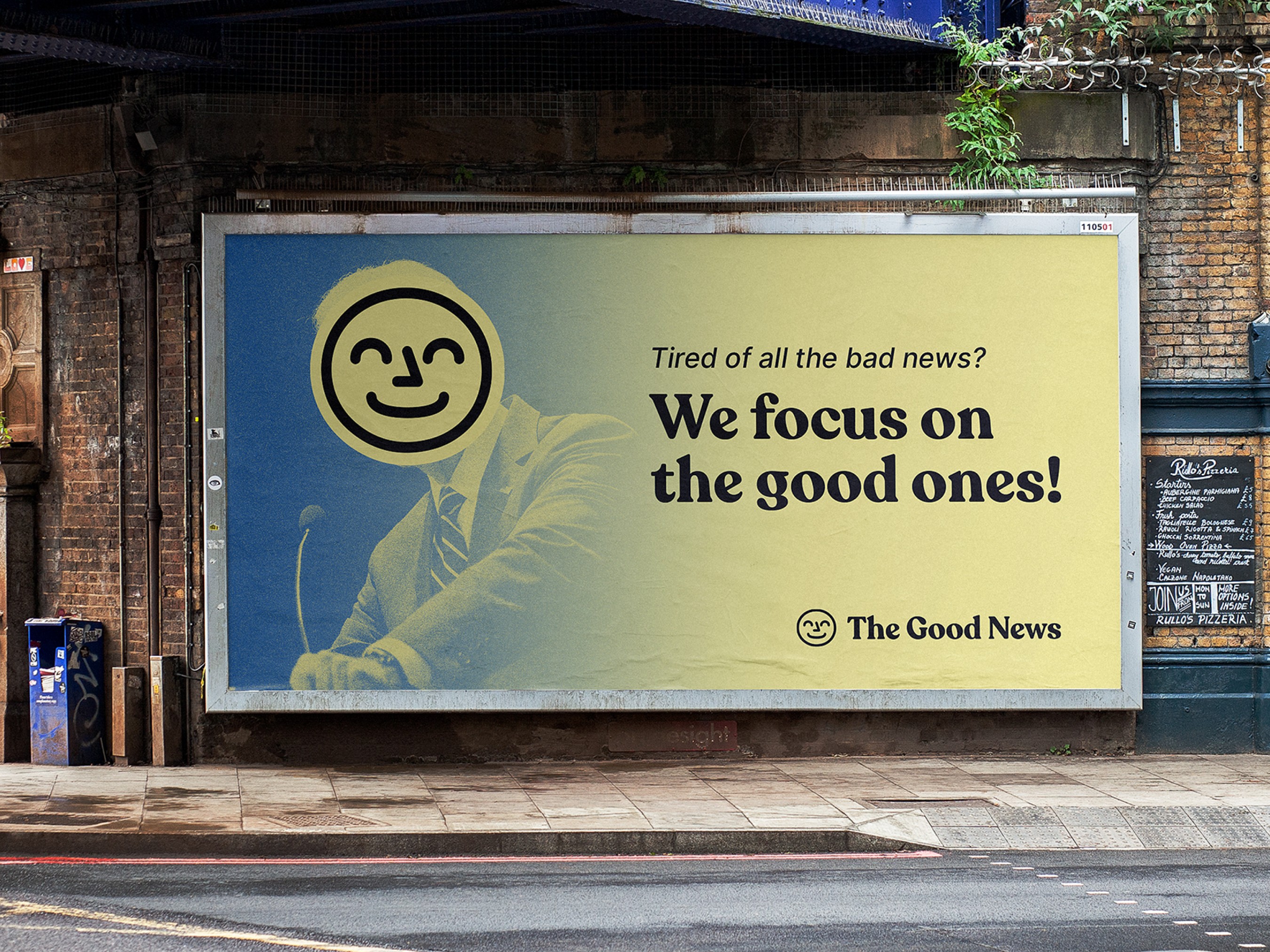
The goal was to develop an editorial-style brand that communicates optimistic professionalism and journalistic credibility. The visual identity uses Recoleta for its soft, nostalgic character, paired with a simple smiling brand mark to reinforce a positive tone. UI sketches illustrate clean layouts and flexible concepts to support the brand's reading experience, refined strategically for hierarchy, structure, and an uplifting yet serious tone.
The Concept
The Good News was an idea created in responds to crisis-driven headlines in modern media by highlighting positive developments, innovation, and everyday kindness. It draws from traditional newspapers' structure and reliability, adapting them into a digital platform that prioritises clarity and stability. The project explores how branding and visual choices shape tone and emotional perception in content experiences, with UI outlines supporting the brand vision.
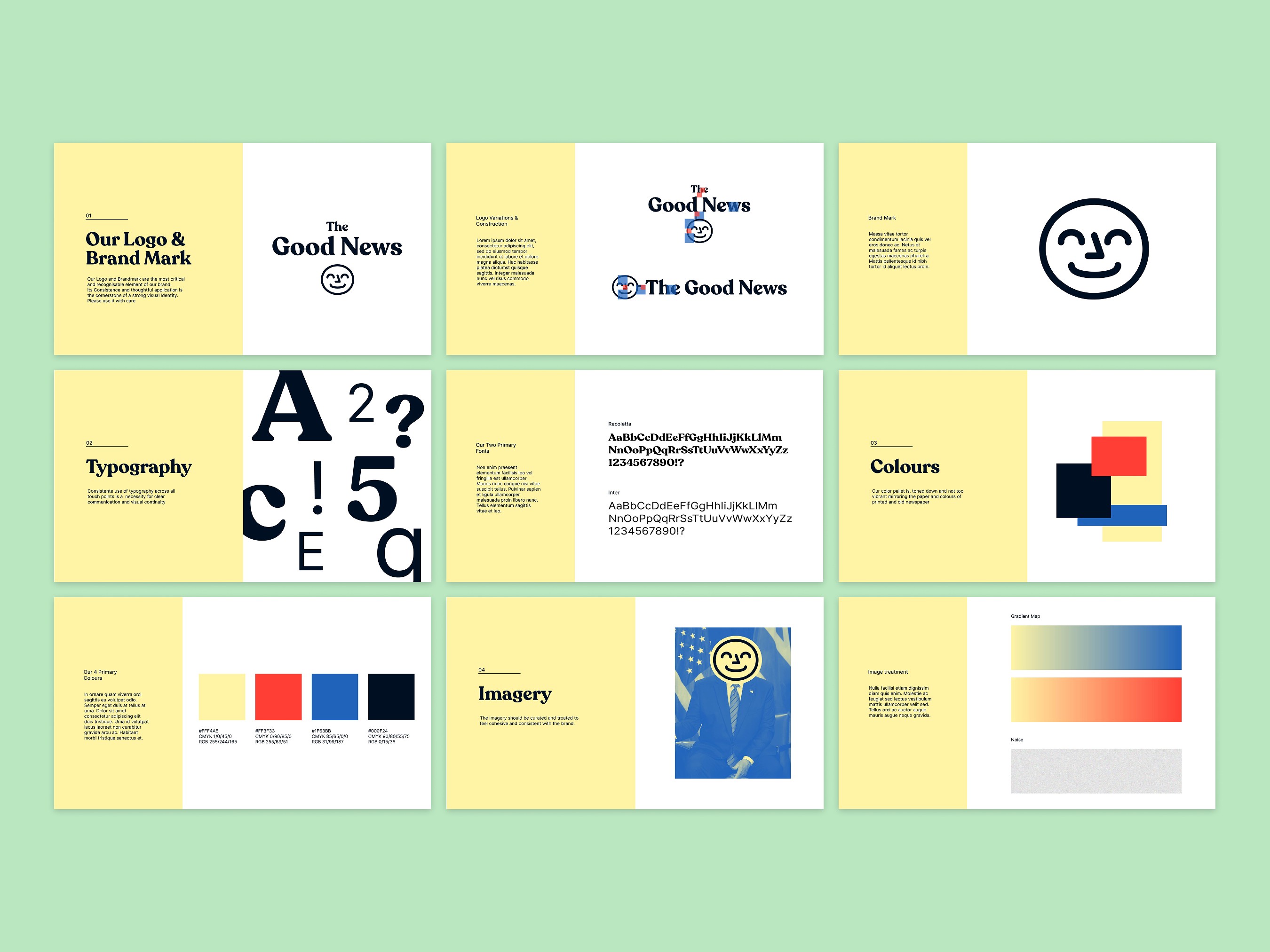
The Results
The outcome is a structured visual identity and brand system with supportive web sketches, balancing editorial aesthetics and optimism. The colour palette nods toward classic newspapers – muted tones with vibrant yellow for warmth and subtle red/blue accents. It uses Inter for clarity and duotone imagery to minimise noise across the logo, page concepts, scalable elements, and a consistent voice for UI sketches, social media, and marketing.